• After 15+ years, we've made a big change: Android Forums is now Early Bird Club. Learn more here.

Found the one thing that's worse than Google UI

nickdalzell

Extreme Android User
iOS 7


Seriously, does EVERYTHING have to look like a child's toy these days? What is it with the CGA graphics, pastels, metro and white space crap? And does anyone know anything about downgrading iOS or is my iPad destined for the garbage?
 
I upgraded my iPad2 to IOS 7 And i didn't like the dashboard that seems to be 2D nowadays.

Changing the standard wallpaper into that starry night sky wallpaper i found out that the icons seem to 'float' on top of that starry sky. I didn't see that feature somewhere else.
 
I upgraded all our iOS devices last night, the look and feel is a bit gimmicky.

I do like how easy it is to close apps in memory though. Conversely I think the new tab structure in Safari looks like crap and not as nice as the old way.
 
the worst part is the new dock bar. it has this ugly huge grey rectangle that takes up far more real-estate then necessary and the icons are twice their size. unlike iOS 6's dock, it no longer has the transparency so my little deer friend's mouth and nose are now cut off.

Performance at least compared with past iOS versions is abysmal. typing is now reduced to 40WPM as the keyboard lags like heck. oh well i needed more time on Android anyway.

@redpill i agree. at least in Android it's confined to the Gapps themselves. i wouldn't be nearly as upset if it was just the OS itself, but it has taken all the apps with it!
 
I was liking the look of iOS 7 until I saw all the white space. Yuck.

That said, iOS did need a major refresh and I applaud Apple for finally listening. The execution does lack a little.

Can't wait to hear my friend with iPhones boast about how revolutionary the control center and live wallpaper are.
 
i like all the "features" my coworkers have been showing me all day.

you know, the ones like live wallpaper, the ability to answer texts and go into settings from the lockscreen that android has had for two years.

smile and nod, smile and nod.
 
I had two coworkers update their devices (iPhone 4 and iPad2) today. Both were a little bummed out mostly because they couldn't figure out all the features. Wanted it too be as "easy" as possible. :rolleyes:
Either way, how I look at it, I actually like it a bit. Biggest issue I saw was with folders, the icons within the folders are super small, both on the iPad and iPhone.
 
i, too, am glad they decided to do something other than remain stuck in the year 2007, however, i think a more modern UI would have more 3-D, not more CGA.

notice how everything is twice the size? i suppose these days resolution and ppi are irrelevant. just make everything as huge as possible so no one clicks the wrong thing. the keyboard also needs work. i can barely tell if i am in caps mode or not anymore. the letters always stay in caps on the keys themselves now, and the caps lock key doesn't stand out as it once did.

I just hope this isn't what Google is planning for Kit Kat or i won't update. i like 3-D, not child's toys.

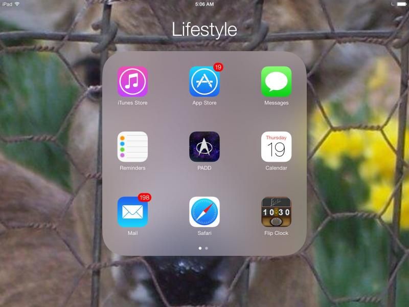
if you look at it enough, no offense, but it appears to be designed for girls. a lot of pastels including pick, turquoise, and the really feminine fonts.

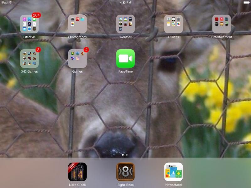
Here's the new dock I was talking about.


FYI the mantra 'but your games and apps still look as dazzling on that high-def screen!' the truth is, that most games won't run until they are updated to support iOS 7, and when they are, the entire puke UI translates to them as well. it seems to show in any app, from iTunes, to App Store, Safari, any web browser, even Chrome. the default pastels are the same colors that Google seems to use a lot. in fact, i wouldn't be too surprised if Google played a hand in the UI design. it certainly bears a remarkable similarity to the direction of the Play Store and various other apps. this may very well be the look that Kit Kat might take.

As for features, other than Control Center which only has two options, i notice nothing added overall. just a new theme, different color palette, and much slower performance.
 
I could be wrong but Safari and the keyboard seem noticeably slower. Typing this message on my iPhone4 is ridiculous, and the page is fully loaded. I don't get why it would be so laggy.

And I know they are trying to make the app transitions interesting with various zoom/fade action, but it's a bit over the top, like trying to watch someone give a PowerPoint presentation where they overuse animation. At some point it's just distracting, and in some cases mildly stomach lurching, especially after a couple glasses of absinthe!
 
i can easily downgrade it by getting an iOS 6 IPSW and resetting the thing, but the sad thing is i have games still stored on the iPad (some that are not available in Android as well, others with progress) that have tons of progress that required hours of grinding over months. don't laugh, i have a MLP: FIM app/game too. i love FiM. call me crazy. i got more progress there and it took months to get that far. that game took GRINDING to get that far. none of that will transfer to my Nexus 10. i'd have to basically play all those games just to get the progress anywhere near the same as they are on the iPad, because if i downgraded now, all of that would be wiped. but iOS 7 is ten times worse than the new Play Store. i literally get sick looking at it.

Anyone know if any of my games' progress was backed up in my last iTunes sync? or would it be wiped as well?
 
i like all the "features" my coworkers have been showing me all day.

you know, the ones like live wallpaper, the ability to answer texts and go into settings from the lockscreen that android has had for two years.

smile and nod, smile and nod.

I've seen Facebook updates like this, all these apple fans claiming that iOS 7 is great but surprisingly someone mentioned that it looks like android and there's nothing iPhone about it except the name lol
 
One of my died in the wool Apple friends was showing me iOS 7 on his iPhone 5 yesterday. He likes some of it, but hates other parts of it. It seems to have gotten a luke-warm reaction compared to other Apple releases. A Lexus forum I'm on(full of apple fanboys by the way) was posting comments about how laggy iOS 7 is and how bad the battery life is.

I laid in bed last night thinking how glad I am that I'm not an iZombie sitting in a camp chair outside of my local Apple Store.
 
perhaps this is just some crazy plan to get everyone on Android. Apple basically saying abandon ship? as for battery life, it seems improved on the iPad but the OS performance is abysmal.
 
Not to beat a dead horse but the new Safari is simply awful on my iPhone4. It's really slow and the tab switching is goofy and unhelpful.
 
Back
Top Bottom