droidros
Android Enthusiast
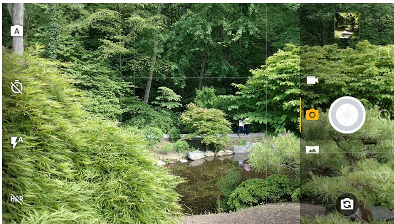
Something changed with the latest version of the default camera app. The icons and shutter button are overlayed on a darkened background which takes up a quarter of the screen! This makes it difficult to frame a wide (16:9) picture because the overlay partially obscures the right side of the picture. It seems totally unnecessary - the icons were just as easy to see without being on an overlay. And why does it take up so much space? Is there any way to get rid of it?

