• After 15+ years, we've made a big change: Android Forums is now Early Bird Club. Learn more here.

ADW Launcher questions

movrshakr

Member
With the new ADW release about 10-30-12, my navigation dots, left and right of the dock, disappeared. I bought the EX paid version (1.3.3.7) thinking they might have been made a premium feature, but I cannot find a way to turn them on in there either.

These dots were completely my method of moving from screen to screen. When I swipe to do it, half the time an app activates instead. An arghhhh situation to say the least. I NEED the dots back!

Does anybody know if they are gone or where to turn them on I am missing? I have emailed the dev 3 times with no answer.

(NOTE: I am not talking about the INDICATOR dots that show which screen you are on; I am talking about the ones you touch to move one screen right or left.)
 
Try going to ADW settings>screen and look for Screen Indicator. The types available to me are "dots top" and "dots over the dock".

This is AWD.Launcher EX (paid version)
 
Try going to ADW settings>screen and look for Screen Indicator. The types available to me are "dots top" and "dots over the dock".

This is AWD.Launcher EX (paid version)

I thought I made it perfectly clear I was not looking for the indicator dots, but for the NAVIGATION dots.

"(NOTE: I am not talking about the INDICATOR dots that show which screen you are on; I am talking about the ones you touch to move one screen right or left.)"
 
I am pretty sure they did away with the least used and needed features and improved else where as needed. Enjoy your day. Have you tried long pressing.
 
Sorry, my bad. I never used them so I forget you could even do that. I've looked through the developer's website and changelogs and it looks like the dockbar was completely revamped. Not sure if they took that out, but I don't see it either.
 
Sorry, my bad. I never used them so I forget you could even do that. I've looked through the developer's website and changelogs and it looks like the dockbar was completely revamped. Not sure if they took that out, but I don't see it either.

Well, isn't that just wonderful. I will wait for one update and see if he puts it back in. Otherwise, I will have to switch to another launcher.

He won't care. I already paid for two--tablet and phone. Can't tell you how annoyed I am at LOSING capability. Wish I had never updated it.

Warning to those considering using it--he takes capability away totally, and he also moves functions in free version up to the paid version. You are warned.
 
You can use launcher actions. There's plenty of them in the menu, plus you can do a custom shortcut. I only have one action to go to home page. I don't have any apps on that but a small digital clock. I want my pretty picture of Navajo Sandstone in Moab. (I took it)
 
Have no idea what that last post was about--seems to have nothing to do with the navigation dots.

OK, I waited for the second update--it did not put the dots in, so I have loaded the previous EX version 1.3.3.56.

But I cannot find in the options where to turn the dots back on. Anybody help my feeble brain?
 
How many screens do you have? These are little icons in Launcher actions that say "page 1, page 2, page 3" with the ability to make more I'd suppose (you can customize a shortcut). I use one just to get back to a blank screen.
 
I am assuming there is a language difficulty here. What you are describing has nothing to do with my problem of wanting the dots back that allow me to navigate to different screens left and right of whichever screen currently shsows.

I have seven (7) screens.

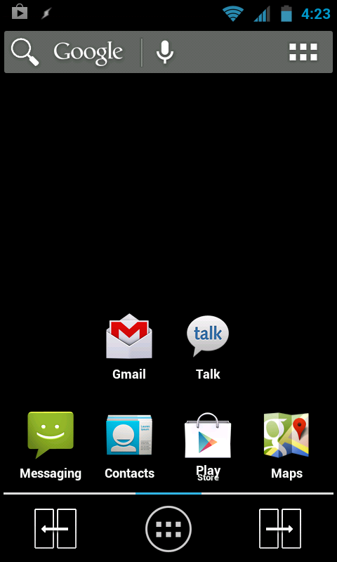
I want to get back the dots that sit left and right of the dock, and when you touch them the screen moves one screen in that direction. I had them, then after an update to the ADW launcher, they disappeared.
 
zuben was saying you can forget about the dots, since they've been removed, and use launcher actions. It allows you to move to different screens using the numbered dots without swiping over them. Kind of like your dots, but lets you move to specific screens.

For example, you are on screen one, and you want to move to the 3rd screen. Instead of tapping your dots repeatedly, just tap on page 3 and you're there.
 
I see. That would be an alternative that could work for some people. I have seven screens. That would mean I would need to put 6 icons on all 7 of my screens to navigate to the others.

I don't have room for that!

Apparently my only alternative is to find a copy of the latest version that had the dots in it...have spent the last hour trying that--unsuccessfully. I don't KNOW what version was the last to have the dots.

Sure wish the author had not removed them. Sadly, This seems to be a common problem where functionality is REMOVED while "upgrades" happen.
 
Depends on the person really. I still couldn't replicate your issue of mistakenly launching apps on a swipe, unless i specifically tried to do it. But on a normal swipe, nope doesn't happen. The feature you are looking for is a feature in Android 2.1 and prior if i remember correctly.

I remembered, why just not set the home button to open the screen previews? Then you can just tap home then select the screen you want.

The 'app starting' on a swipe does not happen every time for me, but "frequently." I admit it may be a function of my phone and the way I swipe, but it does happen enough to be a real problem--for ME.

The Home button opening previews will probably be my fallback, or I may look to see if another launcher has the dots-method. Slight difficulty is that, in the preview mode, the icons are too small to really see what they are. I generally know which DIRECTION to go for app X, but not exactly which screen it is on.

As you use the dots, you get to see each screen full size--pausing as they go by-- and can quickly spot if the needed icon is there--or hit the dots one more time. It is simply how I do (did) it, and it worked great for me. Also, it is a one handed operation.

I guess I am saying that I am still searching for a solution rather than an alternative at this point.

Oh, don't understand your " feature in Android 2.1..." I thought this was something in the launcher, not in the OS????
 
The author, on twitter, told me about "Launcher Action" icons for 'previous' and 'next' that you can use to go forward/backward in the screens. And you can put these in the ends of the dock.

The problem is...when you multiple tap one to go multiple screens in that direction, you get the icon menu instead of screen moves. Arghhh.

Also, the dots showed you instantly whether you were off to the right or left in the screens. They would look like

. dock .....
.. dock ....
... dock ...
.... dock .. etc

so you knew visually whether there were more screens left or right. Yes, I know there is the INDICATOR row you can put nearby, and I have, but it truly is different (better) when your information is right where you are looking (the action place) rather than somewhere else--even if close.
 
Long press on home screen.

Add

Launcher Actions

"Go Next"

Drag Go Next icon down to right hand side of dock bar.

Repeat for "Go Previous" but drag down to the left hand side of the dock bar

screenshot-1356020615048_zps95ce59b6.png


simples
 
Did you not read the part of my post which said...

"The problem is...when you multiple tap one [of those launcher action icons] to go multiple screens in that direction, you get the icon menu instead of screen moves. Arghhh.

Also, the dots showed you instantly whether you were off to the right or left in the screens. They would look like

. dock .....
.. dock ....
... dock ...
.... dock .. etc

so you knew visually whether there were more screens left or right. Yes, I know there is the INDICATOR row you can put nearby, and I have, but it truly is different (better) when your information is right where you are looking (the action place) rather than somewhere else--even if close. "
 
movrshakr, lets be nice. We are all trying to help you out here. (No need for the smart remarks.) As others have pointed out. The dots are no longer being used in this new version as to what you are used to. You have been given a few ways to do something similar to what you were use to doing. Have you tried using the "Gestures". What I mean is, I have swipe up action to present all 7 of my home screens at one time, in helicopter view. I touch the screen I want to go to, and I'm there.
 
I have those dots on the top of my screen. They have the number of screens I have, and they move with the screen. It's in the settings.

It's under Screen>indicator type.

They could be showing up that way since I disabled the damn search bar. I don't have that on any desktop.

I'm using the updated version on a Nexus S.
 
Fair enough, itsallgood. That was a bit direct I guess.

However, I had clearly indicated I was aware of the launcher action icons, and stated what the problem was with those (double tap opens menu rather than move two screens), yet then am presented instructions on how to implement the launcher actions. It did appear to me that what I wrote had not been read.

The swipe up idea is worth a try as a fall-back, but a fallback it is. Reason: the icons are too small to tell what they are in the all- screens view. So, yes, you can easily go to a screen, but you can't really see what is on it before going there. With the dots and screen-at-a-time movement, you see the screens (and icons) full size and can just stop on the one you want when you see the app being looked for. (opinion>>) though not as good as the navigation dots I want back (the ones that navigate, not just the indicator dots), this is a useful fallback.

Another really big usefulness of the dots is that they also show whether you are screen-right or screen-left at the moment, and right where your eyes are focused.

I suppose fundamental part of my interest in this is that the dots approach is near perfect, all the other ways have deficiencies, so why not bring dots back?
 
Back
Top Bottom