Install the app
How to install the app on iOS
Follow along with the video below to see how to install our site as a web app on your home screen.
Note: This feature may not be available in some browsers.
-
After 15+ years, we've made a big change: Android Forums is now Early Bird Club. Learn more here.
You are using an out of date browser. It may not display this or other websites correctly.
You should upgrade or use an alternative browser.
You should upgrade or use an alternative browser.
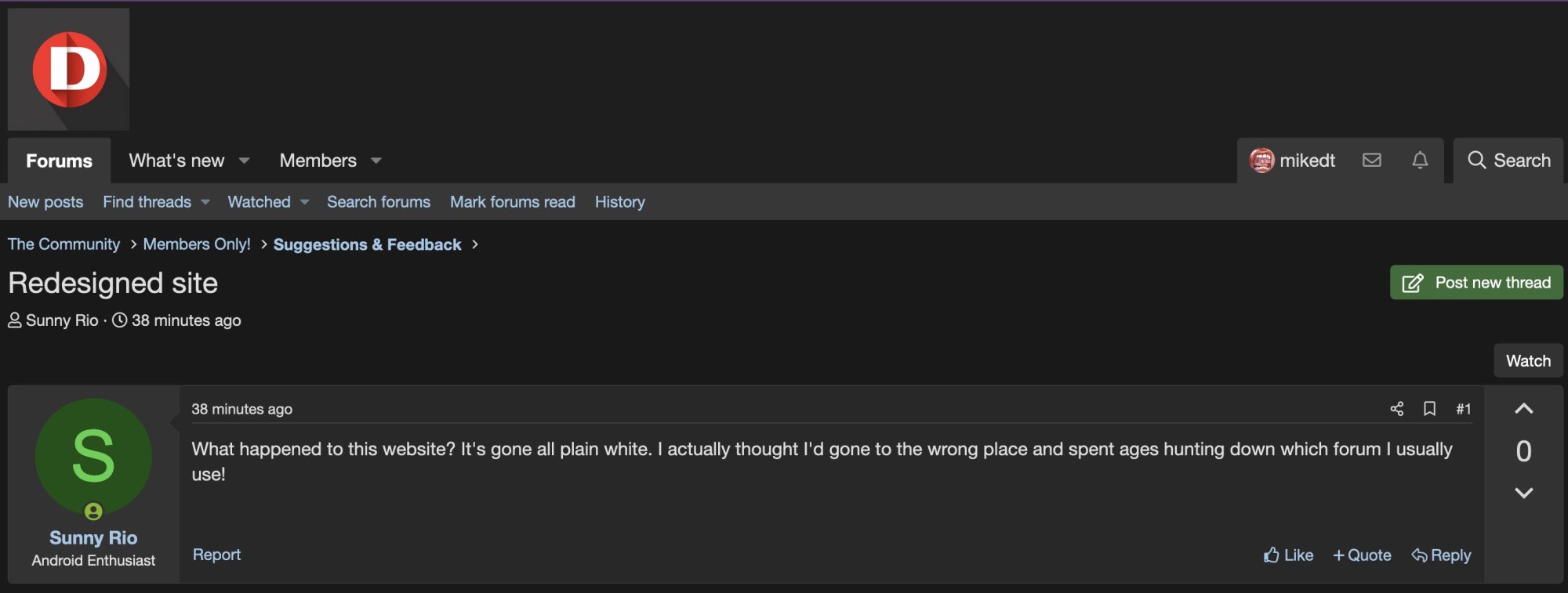
Redesigned site
- Thread starter Sunny Rio
- Start date
FWIW I'm still seeing it in dark mode on computer and phone.

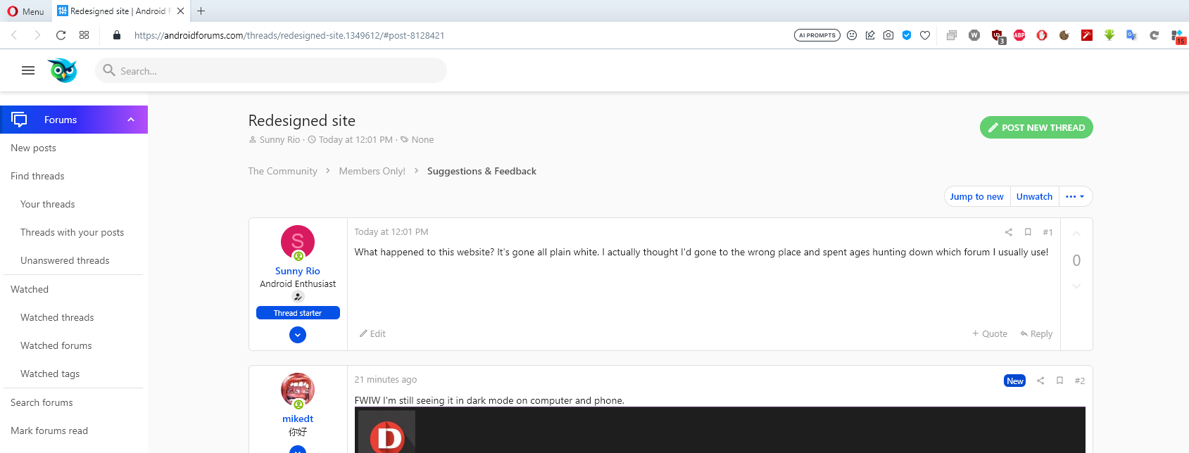
I left it on default, so presumably light mode. I distinctly remember the whole screen being green. I actually thought this was a different site.
This is it on desktop, I don't use it on the phone, it feels like something is missing, like it failed to load something:

This is it on desktop, I don't use it on the phone, it feels like something is missing, like it failed to load something:
If you scroll all the way down to the bottom of the page, there is a theme chooser on the lower left. Click on that and you will see the dark theme option.
Click on Prisma (AF)
Yes that is it. On a forum page it's at the lower left.
That's not the lower left.

Anyway I tried clicking it and the only choice I get is this new one or the dark one. I'm sure it used to be green or more colourful or something.
I checked waybackmachine for the home page Android Forums and got this, which is different but not as colourful as I remember it: Android Forums
I'm sure it used to be so much different, I thought this was the wrong website when I used it today.
If you slide back the date on waybackmachine, it changes all the time. I hate redesign for the sake of it.
Last edited:
Since the change to Xenforo it's just been these two. After the layout change the other day the dark theme got removed so it defaulted to light, once dark was restored you had to manually select it again.
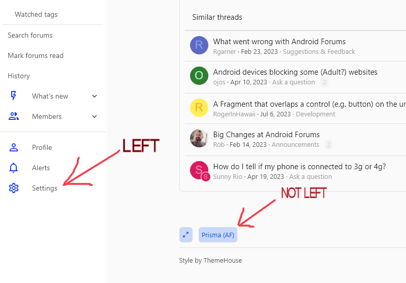
Yes in the settings page the theme option is bottom center, but on a regular forum page it is in fact lower left.
Yes in the settings page the theme option is bottom center, but on a regular forum page it is in fact lower left.
What do you mean by "a regular forum page"? On the page I'm using to type this reply, there's a menu to the left as my screenshot shows. I assumed that was the screen being referred to, since this is where I would be when reading that instruction.
Having looked at the waybackmachine, I can only assume the minor change over the last few months to some of the icons, and the title at the top, was exaggerated by my memory, causing me to think I was on the wrong website. I haven't bookmarked this site, I just type android forums into a search engine, so I thought I'd forgotten which one was this site.
I seriously remember seeing the whole background (which is now white) as being green! Waybackmachine is lying, someone has fiddled about with reality!
Ok I don't have the menu on the left, those items are on a menu bar on top with dropdowns. I guess it depends on the browser.
How on earth can a browser move a menu? There's something badly wrong with a browser if it places a menu left or top.
And no, I just checked - Firefox and Edge also show it on the left, even on another computer. Have you changed a preference on the site somewhere?
I thought it might be screen resolution, but when I shrink the browser window, it's still on the left.
And no, I just checked - Firefox and Edge also show it on the left, even on another computer. Have you changed a preference on the site somewhere?
I thought it might be screen resolution, but when I shrink the browser window, it's still on the left.
Good eye! Nice to see people noticingWhat happened to this website?

We're in the process of making A LOT of huge changes to the site and in the process things will start to look VERY different. You should expect a lot more changes and discombobulation while we iron out a new idea/concept to propel our community for the next 10 years.
As long as you improve it, not make things more complicated like Ebay keep on doing.Good eye! Nice to see people noticing
We're in the process of making A LOT of huge changes to the site and in the process things will start to look VERY different. You should expect a lot more changes and discombobulation while we iron out a new idea/concept to propel our community for the next 10 years.
Ok, now my menus are at the top! Why was mine delayed?
Because you had a good idea, so I put them at the top for everybodyOk, now my menus are at the top! Why was mine delayed?

Not selling anything... just letting you know. Happy to hear any other ideas/opinions you have!I'm not buying that.
You'll probably see a lot of other things changing and out of whack soon. Feel free to say something.
I'm not sure if you were making a joke or what. It wasn't my idea, it was already there, just not for me. Not sure how you made it different for different people either, unless it was done by account name.
Telling me to feel free is most unwise. You may live to regret it!
Telling me to feel free is most unwise. You may live to regret it!
I was being serious.I'm not sure if you were making a joke or what.
I enabled the sidebar view in this new theme. Like you, I was missing seeing the options at the top. Thankfully, after your comment I looked into it, and there's an option to display them at the top (until you're mobile and then it collapses into a menu).
I think different people are seeing different themes because of the style switcher in the very bottom left of the main content area. I have been toying with those and so different people are seeing different things based on whatever styles I made active when they visited the site.
Regarding the open invite on commentary: as long as I'm alive to regret it, I don't think I'll mind!
I don't understand dark themes, do people view websites by candlelight or something?
Another suggestion, use the whole width of the monitor, I'm only on 1920*1080 and the sides are just blank.
I was referring to my habit of getting banned for being rude
Sometimes I'm viewing websites in a dark environment.

A main benefit of dark modes is with AMOLED screens, they consume less power with dark mode, batteries will last longer.
I don't like the current fashion of having everything in whiter shades of pale, like the new design of this website, also Windows 11, and anything Google.
Xenforo (our forum software) just announced XF 2.3 and the first feature they're showcasing is an easier way to handle light/dark themes, so stay tuned! Hopefully we'll be able to update to the new version in the coming months.I don't like the current fashion of having everything in whiter shades of pale, like the new design of this website
Sometimes I'm viewing websites in a dark environment.
Oo er!
Actually I've turned the living room light off for a bit to shut that noisy parrot up. But my eyes aren't bothered by a white web page.
A main benefit of dark modes is with AMOLED screens, they consume less power with dark mode, batteries will last longer.
I like wasting power. Just get more battery.
I don't like the current fashion of having everything in whiter shades of pale, like the new design of this website, also Windows 11, and anything Google.
Maybe you should see an optician? Paper is white. Have you ever bought a book with black paper and white ink?
I like the ability to paste images from the clipboard. Ther're a lot of forums requiring you to paste into a photo editor, save the file, then attach it. Or worse, upload it to a 3rd party site then try to link it.Xenforo (our forum software) just announced XF 2.3 and the first feature they're showcasing is an easier way to handle light/dark themes, so stay tuned! Hopefully we'll be able to update to the new version in the coming months.
Mind you, this forum does have my pet hate. Removing the double spacing from between my sentences. It's how I choose to write, it's easier to read, and it's been proved you can read faster when sentences are seperated. Why on earth would a forum want to dictate what is a personal preference? And in some cases you might want a whole load of spaces for formatting.
No indents.
Two preceding spaces.
Four preceding spaces.
And there we have it, no indents, yet when I go to edit it, it remembers they're there!
But I can quote it correctly!! No, I can't, it just temporarily displays right while I'm replying.No indents.
Two preceding spaces.
Four preceding spaces.
And there we have it, no indents, yet when I go to edit it, it remembers they're there!
