• After 15+ years, we've made a big change: Android Forums is now Early Bird Club. Learn more here.

[SOLVED] Get rid of screenshot notification?

MoodyBlues

Compassion is cool!
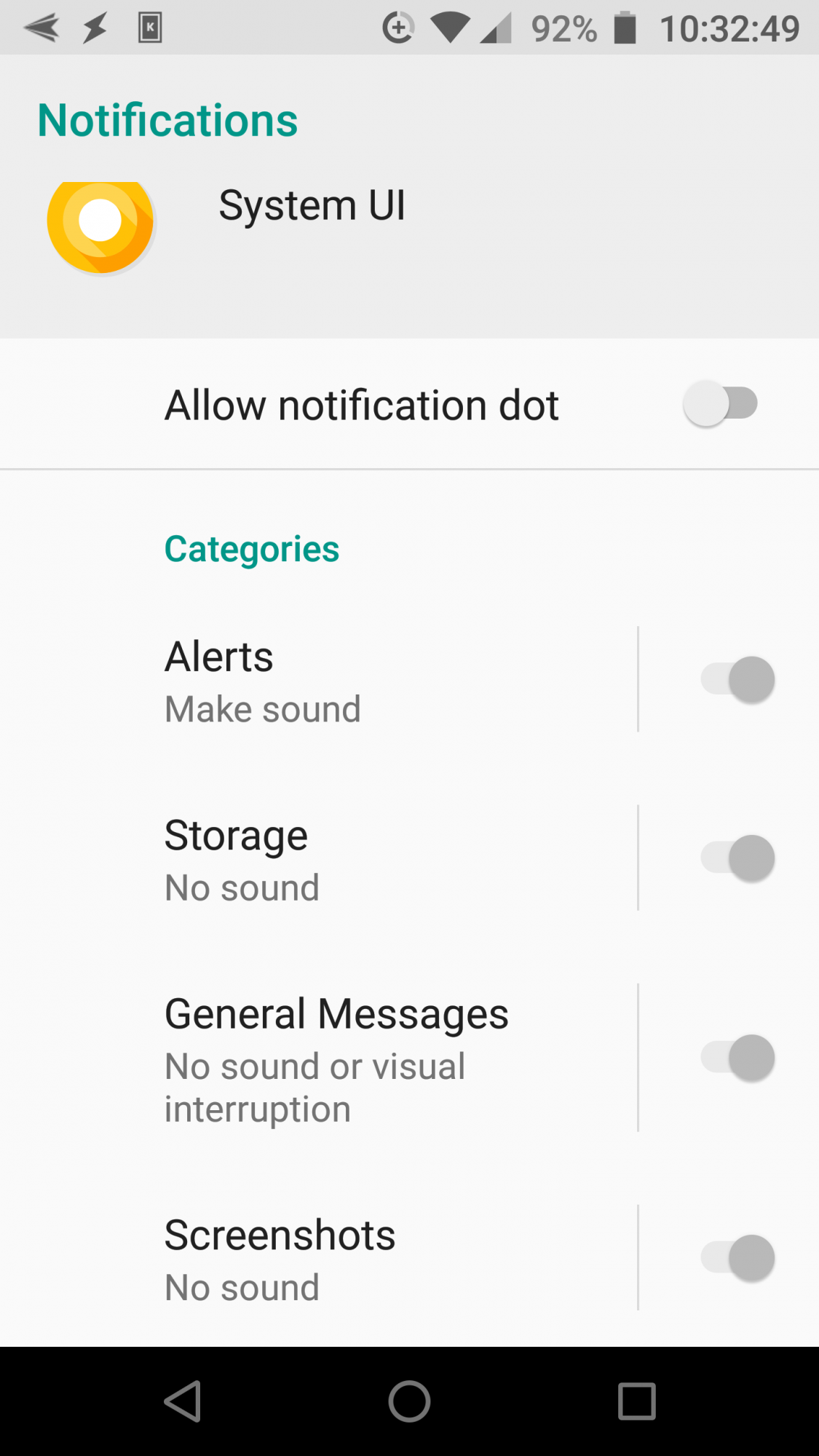
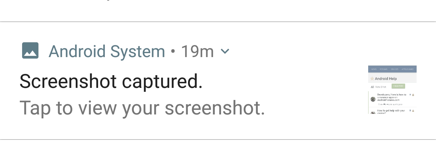
Each time I take a screenshot, this appears in my alerts:
Screenshot_20200515-103213.jpg


Long-pressing on it brings up:

Screenshot_20200515-103252.png


What else can I do--while still using Android's built-in screenshot method? :thinking:
 
1. From the notification window, slide the notification slowly to the left until you see the options icon (gear).
1a. Tap it.
2. Then select the stop notifications option.
3. Thank me very much.
4. All done.
 

Attachments

  • __temp3.png
    __temp3.png
    499 KB · Views: 425
  • __temp2.png
    __temp2.png
    410.2 KB · Views: 381
The stock screenshot setup is a misery all by itself.

There is a great little app, called Screenshot Tile, on F-Droid.

Instead of fumbling around trying to hold two different buttonsvat the same time (the stock method on my devices) you simply pull down the quick settings and touch the screenshot tile.

Of course, after you first start and adjust the app, you must first place the tile where you want it in your quick settings.
You can then longpress the tile anytime to access the settings for the app.
 
The other method I use is very similar.

I use an ad-free screen recorder that also includes a screenshot feature.

Both the screen recorder and the screenshot are accessible via separate and also a single quick tile.
 
The notification can now be completely disabled, because it is a user app, and not a system app.

If you use the screen recorder, I don't recommend going that route, as the notification allows control of the recorder functions.
 
Thanks for the suggestions, @puppykickr, but as noted in my OP, I'm strictly referring to the system screenshot.

I've tried--and have one I like, Screenshot Go--some screenshot apps, but I always end up preferring the default Android method. The two buttons are thoughtfully placed right by each other on my phone, and pressing them just isn't a big deal. I don't like, or want, a button on my screen. No matter where I place them, they're always annoying! :D
It is not a button on your screen. It only is another quicktile in the quick settings menu that you pull down from the top.

At least that is what Screenshot Tile is.

And if you choose the Screen Recorder that I mentioned, there are two quicktiles- one for the screenshot and one for the screen recorder.

It also has the option for a floating set of buttons that disappear as soon as you start, but they are not necessary.

You already have many quicktiles at your disposal, this would just give you some more.

The two button method is designed to make people drop their phones.
 
You already have many quicktiles at your disposal, this would just give you some more.
Yes, but as I said, the Android default method works best for me.
The two button method is designed to make people drop their phones.
I've never dropped mine! :) As noted, the buttons are thoughtfully placed next to each other; taking a screenshot is a simple matter of firmly holding the phone with my left hand, and pressing the buttons on the right.

Also as noted, I've tried various screenshot apps--and always go back to the default. It just works for me! :D
 
I have always hated the stock method for screenshots.

Even if next to each other (and some have not been), they have all been clumsey.

And now that some buttons (power and volume) tend to not work well (or at all), the standard method is impossible.

Pulling down the quick settings is by far the best.

Especially when you consider the fact that the stock method on my first device was power and volume down.
The power button is on top, and volume down is on the right side.
The charging cord is directly on the opposite side.

Just sheer, plain annoying.

I can't tell you how many times the phone hit the floor trying to perform such two handed acrobatics - all while trying not to touch the screen, turn the volume down, turn the phone off, or reset it.

I can still remember trying to take the same screenshot 5 or more times.

Never going back to that hell.
 
Never going back to that hell.
And I don't blame you! If I'd had the problems you've had, I wouldn't like it either.

But I haven't.

It's neither awkward nor cumbersome nor difficult for me. I never drop my phone, touch the screen, or do any of the things that plagued you.
Pulling down the quick settings is by far the best.
Perhaps for some people. I'm just not one of them! :)
 
Perhaps for some people. I'm just not one of them! :)

I have to admit to being one of them. I've struggled with the the two button method on my last three HTC devices.

Having moved away from HTC after nine years and getting the Pixel 3a I was delighted with the very simple method of press and hold the Power button for 1 to 2 seconds, a pop-up appears with three options, the usual 'Power off' and 'Restart' with the third being 'Screenshot'.

Yet another reason why I'm thrilled to bits with the Pixel :D:D.
 
Back
Top Bottom