• After 15+ years, we've made a big change: Android Forums is now Early Bird Club. Learn more here.

Developing Password Manager application for ICS/Honeycomb in 30 Days

safeincloud

Member
I am an independent mobile software developer. I want to develop a password manager application for Android. This is a type of app, where you can store your logins, passwords, credit card PINs and so on in encrypted form. Yes, there are dozens of such applications already available on Android Market and I did try almost all of them (both free and paid). There are some of them: SPB Wallet, Handy Safe, SafeWallet, Password Safe, SplashID, eWallet…

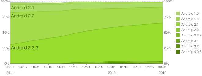
So, why do I need another password manager app? Mostly because of the user interface (UI). Most of the existing apps have so ugly UIs. Some of them seems just never thought about UI and focused only on functionality. Some are ports from another mobile operating systems (Windows Mobile, iOS) and look like aliens on Android. Another important thing is tablets (with Android 3.x Honeycomb). None of the existing apps use tablet’s screen estate for a beter user experience (UX). They just stretch their existing phone UIs on a big tablet screen (often with issues), which is dummy.

And the last, but not least is Android 4.0 UI. In this version of Android (also called Ice Cream Sandwich or ICS) Google introduced a brand new UI – simple, effective, clean and very nice. I am using it daily on my Galaxy Nexus and like it very much. So, my app will follow this style as described on Android Design web site.

My idea is starting today and finishing in 30 days with a fully-featured beta version of the app. I do believe that I can achieve this.

Here in this forum thread (and also in my blog www.safe-in-cloud.com) I will be describing the development process: UI decisions, feature ideas, screenshots and so on.

And want I really need is a feedback from you - passionate Android users. I believe that only this will help me in creating a really good app. So, I will appreciate ANY feedback and suggestions. Thank you in advance!
 
I'd be interested if................. I currently use Roboform Everywhere. But, I don't trust it. If I were to ever lose my phone all my passwords would be available to anybody, Why, because by default as far as I can tell, doesn't require you to enter a master password to enable the use of RF.

If your App could import Roboform passes, and keep up with the syncing........ And require a master pass' for each use I would definitely be interested.

One of the reasons I'm stuck on RF is the easy availability to recently used passwords (favorites). The closest I've come to the functionality of RF is LastPass..... It Sucks! Not intuitive at all.

And I am in agreement with you, the UI's are horrible.

Luck be with you!
Mark
 
If your App could import Roboform passes

Sure, importing from other apps is very important feature. I will add Roboform tho the list.

One of the reasons I'm stuck on RF is the easy availability to recently used passwords (favorites).

This is a very important comment. And here some thoughts about designing UI and a question in the end.

It is always tempting to start coding without a deep thinking first. This is a direct way of cooking yet another application that users cannot use and understand, because of tons of wired features and options. Let’s follow the Alan Cooper’s "About Face 3" famous book about doing right user interfaces. I will oversimplify the process to fit this post in one page:

1) Recognize user’s goals. What do they want to achieve by using this app?
2) Model users. Make one or several virtual persons that will be using your app’s.
3) Write usage scenarios. Make some stories how virtual persons use your app.

These are 3 initial steps. Lets consider them in details.

I think that the main user’s goal is to be authorized ASAP. More precisely, authorized with a password or PIN code. And users do not want to remember all their different passwords. There are lots of another authorization ways like, fingerprints, Near Field Communications (NFC), electronic signatures, but they are out of the scope of our app.

What about users? I think they are common Android smartphone users from 15 to 65-years old.

And now here are som scenarios from own experience.

Scenario #1: Noisy street. Dimmed lights. ATM. Someone behind me waiting in a line. I need to find a PIN for my credit card.

Output #1: Contrast colors and large fonts. Ability to hide passwords from those around you. Minimum taps-clicks for login & fastest search-navigation approach.

Scenario #2: At my computer. Logging to some web site. A browser does not auto-fill my login/password for some reason. I need to find and copy/paste them from the app to a browser.

Output #2: Information copy/paste. Tight browser integration. This is a problem, because the both default Android browser and Chrome for Android do not support extensions yet.

And I would love to hear your scenarios and their outputs.
 
safeincloud, subscribing to this thread, sounds like you're on the right track as far as the UI goes. I have no problem paying for something that makes my life easier and safer.

Fingers crossed!
Mark
 
In fact, Safe In Cloud is a database of records, where each record contains login/password or credit card information. So, the question is how users will organize and then navigate through those records?

All the existing applications of such kind use the old-fashioned folders approach. In this approach, users should create folders first, then create records in these folders. Users (and app authors) are used to such approach on desktop operating systems with their files and folders. So, why is it bad?

* Need to pre-organize a database first by creating folder structure. Or use some predefined folders, which almost don
 
Safe In Cloud name tells you that a cloud is an essential part of the app. It is true. Basically, a user enters his/her data on a phone/tablet and then the app syncs/stores the data to a cloud. A little scary? Not at all. The data is fully encrypted with 256-bit Advanced Encryption Standart (AES) encryption. It was adopted by U.S. government and is now used worldwide.

Actually, all goes into clouds nowadays. Almost all Android users (including me) already have their email, calendar, contacts and photos in the Google cloud. In fact, it is much more safer storing data in a cloud, then on a computer or on a phone, which you can break or lose. And it is also much more suitable in cases, when you move to a new phone/computer. You can restore all your data from a cloud within seconds
 
There is usually a list of records in a password manager application. Assigning a picture (icon) to each record helps users to identify a required record faster and easier. So, it is a common practice now and I am going to follow this practice. But what kind of icons people would like to use? This depends on what kind of records they will have.

Let
 
Today Samsung started rolling out Android 4.0 (Ice Cream Sandwich) update to its Galaxy S II phones in Europe and Asia. This means much more users for Safe In Cloud very soon. As for today there are only about 1.6% of all Android phones have ICS. This is the Platform version chart from Android Developers web site:

android_graph_13_03_12.png


It will be interesting to compare the percentage in a month from now.

So, why Safe In Cloud does not run on Android 2.x? Because of big user interface differences between Android 2.x and Android 4.x. In Android 4.x (Ice Cream Sandwich) Google introduced 4 global changes to Android applications UI. Here they are:

whats_new_nav_bar.png


Navigation Bar. It is always on screen and replaces old 4 under-screen buttons. The new buttons are: Back, Home and Application switcher. No more Menu button.

whats_new_action_bar.png


Action Bar. It is a replacement for old Android menu. Action bar contains icons-actions and three dots at the right for more options. It is also a place for different navigation widgets like a drop-down selector or tabs.

whats_new_multipanel.png


Multiple Panels. Actually, this was introduced in Android 3.x (Honeycomb). You can have two panels simultaneously (left and right), when an app is running on a big tablet
 
I continue implementing the Card list view. Today I added the search box to the Action Bar.

A user presses the Search icon on the Action bar and the Search input widget appears. Then any typing filters the Card list in real-time.

search_small.png
 
Today I added a support for tablets (I have a Galaxy Tab 101. on Honeycomb) in Login and Card list views. Here is the result:

login_screen_tab_small.png


card_list_tab_small.png
 
Android 3.x redefined the lon press behavior. In Android 2.x the long press on an item brings a context menu for this item. In Android 3.x and 4.x (Ice Cream Sandwich) the long press selects an item and allows to select more items with single presses. The long press also brings the Contextual Action Bar (CAB) that replaces the current application Action Bar.

selection_cab_example.png


This approach is used in almost all ICS built-in application. I also implemented it for the Card list view:

selection_mode_small.png
 
What kind of information users usually store in a Password Manager application? The most used types are login-password pairs and credit card details. There are some more, but these two are the champions. Let
 
I believe that free applications on Android is a bad thing. I mean a completely free application, because there are semi-free applications, which you can download for free, but then

  • You will be annoyed with in-app or even pushed advertisements
  • You will be forced doing in-app purchases (e.g. new game levels or full app functionality)
  • You will need to pay for a service to use an app (e.g. Skype credits)

Here is a comparison between free and paid apps on Android and iOS (a bit outdated though).

paid_vs_free_apps.jpg


Source: http://www.androidauthority.com

You can see that there are still lots of free apps on Android. So, why is it bad? Because most of these free apps have no support and further development. It means that they are not being ported to new Android releases, no bug fixes, no additional localizations, no tablet support, no Ice Cream Sandwich UI support. They are single-use or
 
Today I finished the Manage labels view, where users can manage labels. There are two types of labels in Safe In Cloud:

  • User labels. A user can create, rename and delete them. There are three predefined labels: Business, Private and Samples.
  • Special labels. They are All Cards, Templates and Trash. Their names are self-explanatory. A user cannot touch them.

manage_labels_small.png


add_label_small.png
 
So, I am done with the Card list and already started the Card details view, where users can see details of a single card. But what is a card or a record in a password manager application? I decided that each card will have the following attributes:

  • A Title that is displayed in the Card list view (e.g.
 
Back to tablets. Here is the two-pane Card list view that you already saw:

card_list_tab2_small.png


Now a click on a card brings another two-pane view with the Card list on left and the Card details on right:

card_details_tab_small.png


There is a question about card swiping. Does it really fit here? It looks a bit strange: swiping a card changes the selection on the left Card list panel.
 
Today, I spent about 5 hours moving from WordPress platform to Google Blogger. I copied all the old posts and images manually
 
It is time to edit cards. I took two Android Ice Cream Sandwich built-in apps as examples: People and Calendar. And I tried to have the similar look-and-feel and user experience. Here is what I've got:

edit_card.png

Pressing on a symbol pops a menu to select a symbol itself or its color:

edit_symbol.png
select_color.png
select_symbol.png
 
Back
Top Bottom