Install the app
How to install the app on iOS
Follow along with the video below to see how to install our site as a web app on your home screen.
Note: This feature may not be available in some browsers.
-
After 15+ years, we've made a big change: Android Forums is now Early Bird Club. Learn more here.
You are using an out of date browser. It may not display this or other websites correctly.
You should upgrade or use an alternative browser.
You should upgrade or use an alternative browser.


Mr. Lucky
Android Expert
After peeking inside the Etched Material .apk (the basis for the dock icons in my homescreen pic two posts up), I realized that it includes blank backgrounds for theming purposes. The theming doesn't really work, since the foreground will be the stock (colored) app icon, so I decided to make my own (Apex Launcher lets you theme or replace individual icons). Here's what my homescreen looks like now, and adjacent is the second dock (Apex allows scrollable docks, independent of homescreen scrolling). I replaced dock icons 1 & 3 in the first pic and 7, 9, 10, & 12 (continuing the numbering) in the second. 1, 7, 10, & 12 are total custom, made from scratch using Gimp on a pc; 3 & 9 are built-in icons which I changed the background color on. If you are handy with an image editor that handles layers and transparency, the possibilities are almost endless!
Attachments

Mr. Lucky
Android Expert
Needed a change from the all-white look, so here's what I came up with. Uncluttered and gained screen real estate by eliminating the Apex launcher Google bar. The three functions it provided (Google Search/Now, Voice search, App drawer) are now available as hidden Navigation ring targets. Used three different icon packs to achieve the look:


- "Click UI" for the overall icon theming
- "3K SR Black" for the dock
- "Kitkat - Google Now" for the pop-up Navigation ring targets (accessed by long-pressing the Home soft-key)
")

slick_vick
Newbie
EDIT: forgot to add details
Apex Launcher
Minarch (Zooper) widget customized
KitKat Icon Theme
some wallpaper from Zedge
Last edited:
Mr. Lucky
Android Expert


thisISjoel
Android Enthusiast

Not sure how I feel about this wallpaper, makes me feel like I have a Samsung :-/
")
GuitarG20
Clueless Senior Member
Not sure how I feel about this wallpaper, makes me feel like I have a Samsung :-/
I like it. Where did you get it, if I may ask?
thisISjoel
Android Enthusiast
I like it. Where did you get it, if I may ask?
An app called MaterialWalls, lots of cool papers in there.
D
Deleted User
Guest
Here's my home screen.


thisISjoel
Android Enthusiast

Tony Stark's nexus or nah?
Mr. Lucky
Android Expert
Best application of the Lollipop "white look" I've seen yetTony Stark's nexus or nah?

thisISjoel
Android Enthusiast

I love material design and I especially love how many people are making such awesome material style wallpapers! For someone with a short attention span like me I love having a seemingly endless supply of new wallpapers to use!
thisISjoel
Android Enthusiast

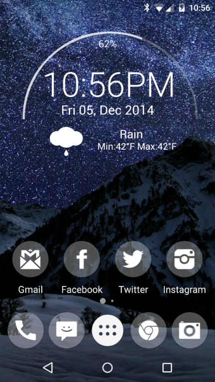
Fresh and dirty!
thisISjoel
Android Enthusiast

#chronus
