jbdan
Extreme Android User
I'm not sure how to make the pic smaller... Sorry.
Love it! Since you use photobucket you can customize your upload options and specify what you want. The 640x480 works very nice for these home screenshots.
")
Follow along with the video below to see how to install our site as a web app on your home screen.
Note: This feature may not be available in some browsers.
I'm not sure how to make the pic smaller... Sorry.
I don't know how they sized them but the couple I've done have been at the size I listed and they worked.
This is what I've got so far from what I've gathered from this thread.
View attachment 25848View attachment 25849
yep - i just tested and confirmed this morning that it is definitely 1440x1280. so if you are cropping an image for wallpaper - set the exact center of your image at the intersection of pixels 720 Horizon and 640 Vertical. i use the MS Paint ruler for this.
What is the home screen by itself? I was thinking 720W x 1280H ... but I'm not sure that's right.
boom.
Zygot 1.8 rom
nova launcher
softkey mods
Slick. Not sure I like the red on the softkeys, but I don't dislike it either. Wish they were centered tho, is the only thing I can really say. They just seem out of sync, ya know?
Still cool
there we go!Slick. Not sure I like the red on the softkeys, but I don't dislike it either. Wish they were centered tho, is the only thing I can really say. They just seem out of sync, ya know?
Still cool
there we go!


Just a wallpaper change, I have a thing for blue so I found this one that I like:

How do you make diagnol words?
Looks like it might be using Simple Text - Text Icon Creator from the market. It allows you to turn the words. It actually allows a lot of changes. Might have to use Nova Launcher though. Not sure about that one[/QUOTE
Simple text and you do not need nova launcher
Looks like it might be using Simple Text - Text Icon Creator from the market. It allows you to turn the words. It actually allows a lot of changes. Might have to use Nova Launcher though. Not sure about that one[/QUOTE
Simple text and you do not need nova launcher
Good to know. When I tried simple text in the launcher it didn't like it. I shall try again on my next round of icons
Pretty simple

Pretty simple
Can you share a link to this wall?
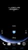
Can't sleep tonight, so I've had a play with my phone..
Heres my homescren:

Widgets used:
SiMi Clock Widget
SiMi Weather
Circle Battery Widget
Heres an ap launcher widget when I click in the middle of my screen:

Widget used:
CircleLauncher Light (made the transparency 100%)