cruiser771
Well-Known Member
ok so its not the real Sense UI, but the Sense look ") . I've seen and used several different Sense themes and packages floating around, and put the best together. I can't claim credit for the widgets, but I did modify the dock image from another package which was nearly perfect but had the arrow incorrectly facing down. I also created a special dock with a layer of transparency for the LauncherPro screen indicator, which i think looks kinda cool although it doesnt run along the top curve like the real Sense one, but I have no control over that. So these are all new docks which I haven't found anywhere else. If there's a better package out there, please post it, but I think this is as close as its gonna get. I wrote a detailed set of instructions as well, so it should be easy for anyone to understand them.
. I've seen and used several different Sense themes and packages floating around, and put the best together. I can't claim credit for the widgets, but I did modify the dock image from another package which was nearly perfect but had the arrow incorrectly facing down. I also created a special dock with a layer of transparency for the LauncherPro screen indicator, which i think looks kinda cool although it doesnt run along the top curve like the real Sense one, but I have no control over that. So these are all new docks which I haven't found anywhere else. If there's a better package out there, please post it, but I think this is as close as its gonna get. I wrote a detailed set of instructions as well, so it should be easy for anyone to understand them.
HTC Sense Theme
Update 1/4/11: Redid the docks (except the low res dock) in the package, the changes are very subtle, but its even more like the HTC dock now. If you downloaded it before 1/4/11 (about 50 of you), you can get the new dock here. the difference is mainly the curvature of the dock, its not as narrow on the ends now. nothing big, but it bugged me so i fixed it, Enjoy
Update 1/6/11: ok redid the dock again, you can download it here or get everything at the main link above. its the best so far but comes at a price.... it requires a dark background to look good. This is because of some anti-aliasing issues i had, as im not a photoshop pro, and is probably why the original dock i started with completely cut off a portion of the top curve. so on a light background, you will see dark spots along the top of the curve, but looks great on most backgrounds. ill try to make one that's optimized for light backgrounds. heres a comparo between all the docks in the zip, and the real HTC dock.
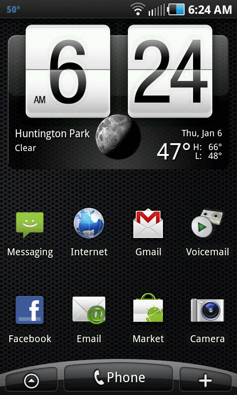
1st image (6:24 on clock) - dock with narrow ends, but still looks good
2nd image (6:28) - dock is a little fatter on the ends
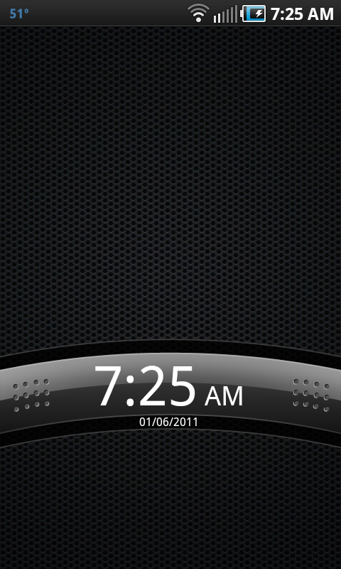
3rd image (9:07) - dock has the gray line at the top, but wont look as clean on a light background for reasons mentioned above
4th image (bright background) - a screenshot of the real HTC Sense
. I've seen and used several different Sense themes and packages floating around, and put the best together. I can't claim credit for the widgets, but I did modify the dock image from another package which was nearly perfect but had the arrow incorrectly facing down. I also created a special dock with a layer of transparency for the LauncherPro screen indicator, which i think looks kinda cool although it doesnt run along the top curve like the real Sense one, but I have no control over that. So these are all new docks which I haven't found anywhere else. If there's a better package out there, please post it, but I think this is as close as its gonna get. I wrote a detailed set of instructions as well, so it should be easy for anyone to understand them.HTC Sense Theme
Update 1/4/11: Redid the docks (except the low res dock) in the package, the changes are very subtle, but its even more like the HTC dock now. If you downloaded it before 1/4/11 (about 50 of you), you can get the new dock here. the difference is mainly the curvature of the dock, its not as narrow on the ends now. nothing big, but it bugged me so i fixed it, Enjoy
Update 1/6/11: ok redid the dock again, you can download it here or get everything at the main link above. its the best so far but comes at a price.... it requires a dark background to look good. This is because of some anti-aliasing issues i had, as im not a photoshop pro, and is probably why the original dock i started with completely cut off a portion of the top curve. so on a light background, you will see dark spots along the top of the curve, but looks great on most backgrounds. ill try to make one that's optimized for light backgrounds. heres a comparo between all the docks in the zip, and the real HTC dock.
1st image (6:24 on clock) - dock with narrow ends, but still looks good
2nd image (6:28) - dock is a little fatter on the ends
3rd image (9:07) - dock has the gray line at the top, but wont look as clean on a light background for reasons mentioned above
4th image (bright background) - a screenshot of the real HTC Sense