• After 15+ years, we've made a big change: Android Forums is now Early Bird Club. Learn more here.

Help Icon Request from Commando Rooters

BLACKTOOTHGRIN

Android Enthusiast
I have a small request from you Commando Rooters out there:

I've tried the Go Launcher app and like it quite a bit,
but I really miss the stock Doc Icons of the Commando.
I was wondering if any of you guys would mind posting those
3 icon image files so I can use them with the Go Launcher app.
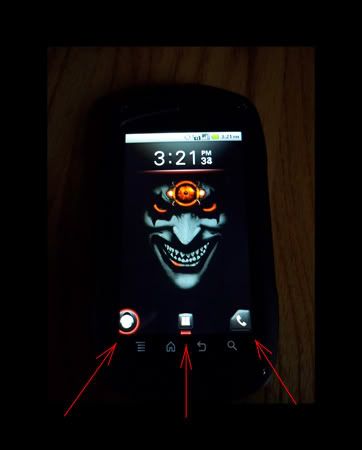
ICONREQUEST.jpg


I need:
1. Phone Icon
2. Apps Icon (Both with & without Red Glow underneath if possible)
3. Snap Out Menu Icon
(Both with and without Red Glow around it if possible)
Yes, I know the snap out menu icon won't function, but I can still link it to another app of my choosing. ;)
 
No idea how to do that...
screenshot_old-phone-icon.png


:)
I think it looks like crap, but if you want the ones I found in the old launcher "Home", send me a PM with your email address. I don't want to host them. I will send you all of them and let you decide.

I am not sure if the snap-out is in this collection or not....it may be somewhere else.
 
Thanks Rafael.
I sent you a PM.

Yeah...they will look pretty bad with any kind of colored backdrop,
but I seem to stick to black so I think they'll be fine.
While alot of other people really hate them...
I just really like those icons for some reason.
But I've never really painted inside the box either. :cool:
 
That's GREAT Rafael, thanks a bunch!
These should work perfectly for my intentions.

Since I don't know what folder you pulled these from,
and not being able to see the list for myself, -Not Rooted-
I don't have a clue where they could be located.

Hopefully someone will chime in and post the location. ;)

If you stumble across them at any point, please let me know.
I'd really like to have the snap out icons as well.
 
It's pretty simple once you are rooted.
With a file manager like Root Explorer, open the /system folder, the open the /system/app/ folder. Then touch the app you want to work with, in this case it was the "Home" app (full name is "com.nec.android.ncmc.homeapp"). Root Explorer gives you the option to install or view the app.
Choose view.
This will open the applications contents including some subfolders.
Open the "res" folder, then open the "drawable-hdpi" folder. All of the icons I sent you are in that folder, along with lots of other imagery like wallpaper.

If you want to save them to the SD so you can save or send them, as I did here, then from the app list in /system/app/ do the following:
Long-press the app and hit "extract" to extract the contents to the SD....then you can move them to a PC to work on them in other ways. This is how I got you the icons.
 
Like I said....I have no clue where the snap-out icons are. I expected to see them in this app. Is the snap-out icon the same as the unlock button?
If so, it could be buried deeper in the system and not in a traditional app like these were.
 
Right on!
Just got them.

Not to be picky,
but something you had just said got me thinking....
The unlock IS the same type of icon as the snap out
BUT IN A FULL CIRCLE.
(see how the snap out icons are cut off?)

Any chance of finding that last one?
Only reason is because the dock on Go Launcher
won't allow you to snug an icon up to the endge of the screen.
It's using some padding I think.
 
The unlock will be a tough thing to locate.
The problem with is it's likely not located within an app like the other icons.
I have no idea where to look for it.

If I happen across it I will certainly let you know.

Try editing the icon:
It should be a simple thing to copy and paste the missing section using an image editor. Copy the complete half, paste it and flip it, then paste it over the missing portion of the original.
 
Good suggestion.
Worked liked a charm.

Now I just have to find a good launcher that will do what I want.
GO Launcher is my favorite by far, but it puts some kind of padding at the
top that won't let me snug my clock up against the status bar.
Even if I hide the status bar it still leaves that big gap at the top
and makes everything look terrible.

Launcher Pro is pretty similar to GO and does everything the way I
would want, but there isn't any up/down swipe shortcut function. :(
I don't know if that's an option in the paid version,
but I'm not going to pay $4 not knowing.
Maybe I can try contacting the developer.
*Nope, can't find a contact link anywhere. Oh well.*

ADW is okay...
but it only allows for 5 dock shortcuts that are non scrollable or able to be hidden.
It also has a very backwards way of hiding apps in the App Drawer.

Are there any other good ones out there that you know of?
 
Cool.

As to your dislikes of GoLauncher.....
That gap doesn't bother me......I like having a gap so I don't hit the notification drop-down by accident.
When I was looking at launchers, most of the threads I read showed GoLauncher was the preferred one. I got it and never looked any further......I really like it.
 
Make yourself a new wallpaper that fills that gap with the words:
"Blacktoothgrin is one bad mofo!"
That will fill the gap. :D
 
sh*t....:cool:

It looks like GO Launcher is going to be releasing another update
sometime this week by what their site says.
I noticed that the gap at the top is being complained
about by more than just me, so hopefully they'll fix it soon.
 
First off...
A BIG THANKS TO RAFAEL FOR MAKING THESE AVAILABLE!
I figured I'd post them in case anyone else wanted to use 'em.

These are the original icon files.
I found them to be a tad small "as is"
but I'm sure they would be fine for most:


nec_btn_snapmenu_left.png


nec_btn_snapmenu_right.png


nec_hotseat_phone_left_normal.png


nec_hotseat_phone_right_normal.png


nec_hotseat_phone_left_pressed.png


nec_hotseat_phone_right_pressed.png


nec_all_apps_button_normal.png


nec_all_apps_button_pressed.png


nec_ic_snap_land_normal.png


nec_ic_snap_land_focus.png


These are the same icons,
I just trimmed them up so they would
appear a bit larger on the home screen:


SnapOutIcon-Active.png


PhoneIcon.png


PhoneIcon-Active.png


HideShortcutsIcon.png


HideShortcutsIcon-Active.png


AppsIcon.png


AppsIcon-Active.png


These are just two that
I made for myself to use for mail and misc:


MailButton3.png


SkullButton.png


Enjoy....:)
 
Good work!

Your modified ones are pretty cool!

Not sure if you want to take this on, but......
Make the full-square ones (like the skull) for mail, messaging, web, and maybe a filing cabinet(to use for app drawer) and I would consider replacing my Go-Launcher icons with them and some of the original ones.

I currently run these, left to right:
Phone, messaging, app drawer, mail, web.
 
Okay Raf,
I finally got some time
this evening to make those buttons for you.
Hope these will help you out man:


JokePhone.png
JokeMessaging.png
JokeApp.png
JokeEmail.png
JokeWeb.png


DID I GET THEM IN THE CORRECT ORDER?


36_5_2.gif

36_2_27.gif
36_2_34.gif

36_12_6.gif
 
Just kidding ya man...Here ya go:

BTG-PhoneButton.png
BTG-RafMessageButton.png
BTG-AppDrawerButton.png
BTG-EmailButton.png
BTG-EmailButtonAlternate.png
BTG-WebButton2.png


I made two different email buttons and couldn't decide between them.
Take your pick.

If you don't like your name in the messaging balloon,
here's one that's blank.
(I just thought that it looked like it was lacking something being blank in the middle)

I'm also posting the blank one because I don't think anyone else would
like to use the one with your name in it...haha. :cool:

BTG-MessageButtonBlank.png


Hope they work for you.
-AND ANYONE ELSE OF COURSE-:)
 
That is damn nice of you!

I actually like the silly ones you posted.....but got a laugh out of them as well. :D
I prefer the others.....but those are unique!
The other ones are excellent! I think others will be interested in these as well.
Good work, Blacktoothgrin!
 
Haha...no problem.
That first set was just a joke of course.
Kindergarten Baby, Now THAT'S OLD SCHOOL!
I get a kick out of making people shake their heads sometimes.
Glad you liked the others though.

Something just dawned on me when I was scrolling
through this thread.
Your wallpaper is blue.
I made these with a darker background in mind,
just because that's what I prefer.
I never really thought about how they would look against a lighter background.
Probably not quite as good.

Here are the icon files that I made before placing them on the buttons:
(They may or may not look better on a lighter colored background)
I didn't feel like pulling the original phone icon
out of the stock button, so I just made new ones.
(It'll probably look better against a light background anyways)

asshole.png
Phone2-NoButton.png
RAFMessageIcon-NoButton.png
MessageIcon-NoButton.png
FileCabinetWithoutButton.png
EmailAlternateIcon-NoButton.png
EmailAlternateIcon-NoButton2.png
EmailIcon-NoButton.png
EmailIcon-NoButton2.png
WebIcon-NoButton.png


I also got thinking that maybe other people don't like the Glowing Buttons,
so here are the Plain Buttons I made without the glow.

PhoneButton-NoHighlight.png
PhoneButton2-NoHighlight.png
OriginalPhoneButton-NoHighlight.png
RAFButton-NoHighlight.png
MessageButton-NoHighlight.png
AppDrawerButton-NoHighlight.png
EmailButton-NoHighlight.png
EmailAlternativeButton-NoHighlight.png
WebButton-NoHighlight.png


Last one:
The New Glowing Phone Button

PhoneButtonAlternate.png


Later. :cool:
 
Back
Top Bottom