davoid
Android Expert
Is it just me or does anyone else think the new dialer has made somewhat of a step backwards in ease of use and style?
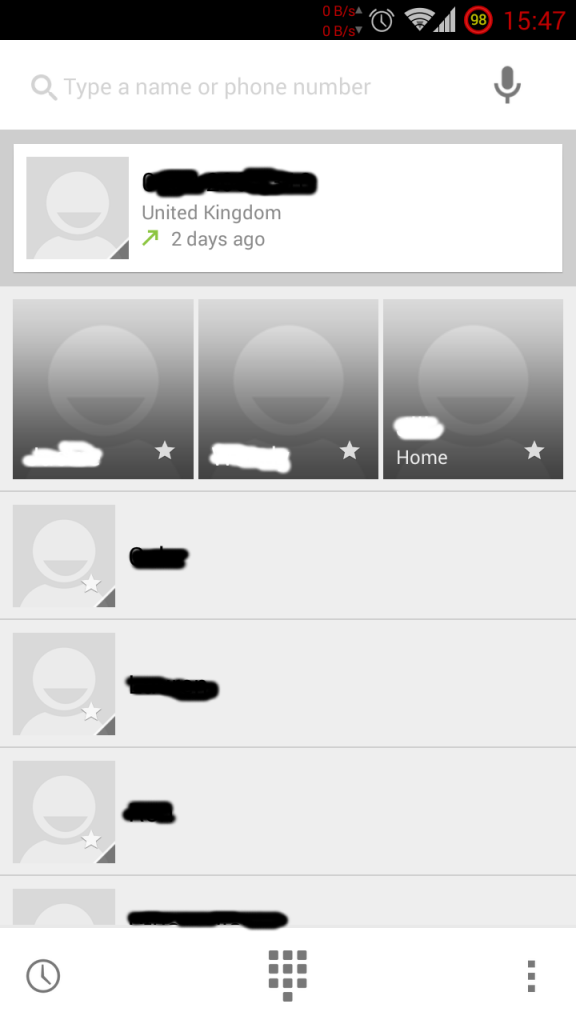
With the previous dialer I would just tap my phone icon, and would be confronted with the numerical dialer. Now I get a mishmash screen on which I have to tap again if I want to either dial a number or make a search.
Before I could just start dialing or I could spell out a contact's name on the dial pad which would bring up an auto-complete list of contacts.
Also I liked the previous dark theme, not this nasty white thing.
I want the old dialer back.
Or a better alternative...
")