xx_bishop_xx
Android Expert
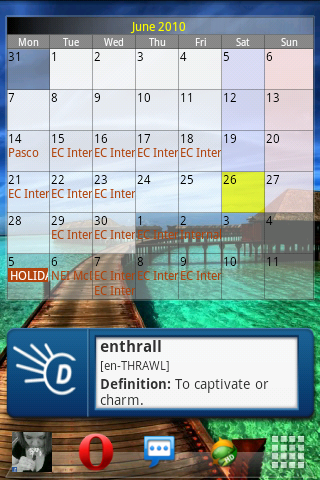
what is it called in the market
Fancy Widget
Fancy Widget v1.2.7 Application for Android | News & Weather
Follow along with the video below to see how to install our site as a web app on your home screen.
Note: This feature may not be available in some browsers.
what is it called in the market
thank you good sir

I really like getting rid of the notification bar, which is available with a touch of "menu."
What toggles are those?^
Ok, last change to the main screen for a while..

sweet Thanks !! I guess i use metamorph.. or how?

Beautiful simplicity. And Launcher Pro
LOL man you got every possible square inch on ur home screen covered. How is that simple? LOL
") lol
lollol. The way I see it, there's 3 sections.
1. Time/weather
2. Last person I contacted and everything I can do to them
3. My four most used apps. (Other than the crap in the dock.)


Messaging Widget?
Beautiful simplicity. And Launcher Pro