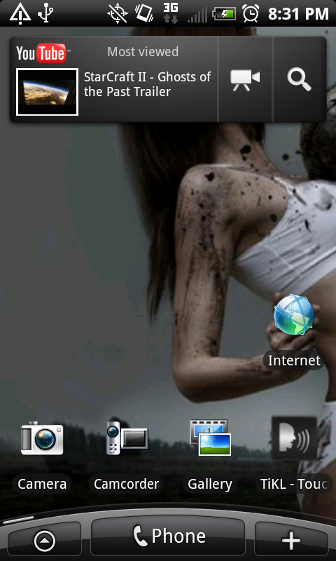
Yes that is where I got the icons. I do not crop. I do not resize the original file either. I stay away from the ones with shadows from that site. The shadows in mine are part of the dock.
This can be a bit of work but its not too bad.
Click on the individual icon you want until it is really big and right click and save image. The image size should be huge at like 420x420 or something.
I have been using. 72x72, originally I was told 80x80 but found in android sdk they say to use 72.
Ok so open your icon in photoshop. Now open a new file and size it to 72x72 drag it so the 2 pics are next to each other. Click on the icon box, now hit control T and you will see a box form around your icon. Now HOLD SHIFT then grab a corner wirh mouse and drag the icon until it is similar in size to the 72 box. Now hit enter . Drag the icon over to the 72 box and fine tune your size with control T again. Holding shift keeps height and width together so you don't squash your icon.. lol.
now save the file as a .png and don't forget to make the background transparent. Now load it on your phone for testing.
I found this method keeps the icons looking the best.
Pm me if you are having trouble, I won't be around untill later pacific time

")