• After 15+ years, we've made a big change: Android Forums is now Early Bird Club. Learn more here.

Root [Theme] Honeybread for ApeX 1.4 (Updated 3/2/11)

ECFfighter7232

Android Expert
This theme is still being worked on but its pretty complete so far. I will be updating it as more things are added to it.

honeybread1pic.jpg


honeybread2pic.jpg


bluebar.jpg


Wallpaper
default_wallpaper.jpg


Installation:
MAKE A BACKUP BEFORE INSTALLING I'm not responsible for what you do to your phone

Download the theme from HERE
place the .zip onto the root of your sd card
use Droid X Bootstrapper and boot into recovery
install .zip from sd card
choose .zip from sd card
scroll to Apex-1.4.1_Honeybread_v2 and install it
reboot phone.

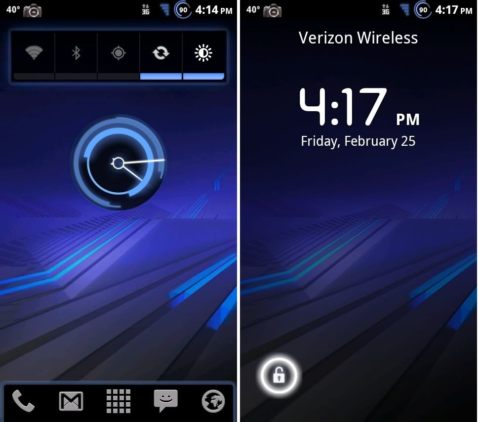
Themed system apks include Settings, Desk Clock and Market (more to come)
A LOT of images in the system/framework-res.apk have been changed
the vibrate slider on the lock screen has been made invisible (its still there if you want to use it, I just think the honeycomb lock icon looks better by itself)

Changelog for v2:
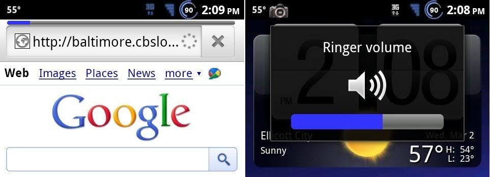
progress bars color have been changed
fixed the flip-flop 3G icon
fixed the vibrate slider issue
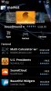
added the Honeycomb themed market from XDA
added the "clunky red number" fix from bouchigo

Extras:
If you are using launcher pro there are two themed versions that go perfect with this theme
s23honeycomb.png

can be downloaded HERE
And
s23honeycomb2.png

can be downloaded HERE

credit to Haxzamatic for all his work on the CM7 theme that this originated from and obviously to Fab for all his great work on ApeX
Also, thanks goes to faber78 and Aggie12 for helping me learn some of the image editing stuff and a BIG thanks to bouchigo for helping me with my questions!

Hope you guys enjoy it!
 
Don't mean to sound rude, but is it just me, or does the look of Honeycomb just kinda meh to you guys?

Im glad he did this, but I personally would never use it. Just curious if folks actually like this look overall? I prefer the gingerbread green better myself.
 
Don't mean to sound rude, but is it just me, or does the look of Honeycomb just kinda meh to you guys?

Im glad he did this, but I personally would never use it. Just curious if folks actually like this look overall? I prefer the gingerbread green better myself.

I prefer the blues in honeycomb over the greens from gingerbread.
 
Don't mean to sound rude, but is it just me, or does the look of Honeycomb just kinda meh to you guys?

Im glad he did this, but I personally would never use it. Just curious if folks actually like this look overall? I prefer the gingerbread green better myself.

i agree, i do love the green look that came with the original ApeX, but man... this blue looks SEXY! ;)

big ups, EC!
 
Thanks for the replies, I was just curious.

I just don't like that shade of blue, or the signal and battery status icons.
 
Its cool. Everyones allowed an opinion. Some themes out there aren't for me either. Thats why its great to be able to choose what you want.

Totally true man. The world would be a boring place if we all had the same thing right?

Choice = a good thing.

Cheers brother.
 
Awesome job and thanks to everyone involved. This is great! Put the neon honeycomb market from XDA with that and the Honeycomb themed LPP from S23 on XDA, phone is ultra seXi!

EDIT: Screenshot of homescreen was with the built in ADW in Apex.
 

Attachments

  • CAP201102251601.jpg
    CAP201102251601.jpg
    190.4 KB · Views: 448
  • CAP201102251554.jpg
    CAP201102251554.jpg
    262 KB · Views: 428
  • market.jpg
    market.jpg
    210.6 KB · Views: 375
  • LPP calendar.jpg
    LPP calendar.jpg
    238.7 KB · Views: 399
K, I tried it out and am loving it so far. Only 2 small nitpicks I've noticed.

1. The 3G icon is white when not in use, and then changes to the blue when in use. Dunno if this was intentional or not, but I like stock theme on apex where the icon is green when not in use, and the up and down arrows light up when in use.

2. The progress bars on the browser and others places, along with the check-boxes are still gingerbread green. Other than that, I haven't found any problems. Would love to donate/help if possible.

snap20110225174453.png
snap20110225174456.png
snap20110225174459.png
Some great screens of it in action (used honeycomb lpp over at xda):

 
Don't mean to sound rude, but is it just me, or does the look of Honeycomb just kinda meh to you guys?

Im glad he did this, but I personally would never use it. Just curious if folks actually like this look overall? I prefer the gingerbread green better myself.


I agree. But that may be because I think there's too many blue themes. I'd prefer red or even purple myself; just something different. I do like the lockscreen though. And it's still a nicely done theme.
 
K, I tried it out and am loving it so far. Only 2 small nitpicks I've noticed.

1. The 3G icon is white when not in use, and then changes to the blue when in use. Dunno if this was intentional or not, but I like stock theme on apex where the icon is green when not in use, and the up and down arrows light up when in use.

2. The progress bars on the browser and others places, along with the check-boxes are still gingerbread green. Other than that, I haven't found any problems. Would love to donate/help if possible.

snap20110225174453.png
snap20110225174456.png
snap20110225174459.png
Some great screens of it in action (used honeycomb lpp over at xda):


Ditto here. Like it so far.
 
K, I tried it out and am loving it so far. Only 2 small nitpicks I've noticed.

1. The 3G icon is white when not in use, and then changes to the blue when in use. Dunno if this was intentional or not, but I like stock theme on apex where the icon is green when not in use, and the up and down arrows light up when in use.

2. The progress bars on the browser and others places, along with the check-boxes are still gingerbread green. Other than that, I haven't found any problems. Would love to donate/help if possible.

Yeah the 3g icon thing is supposed to be like the. Theory there is to show when data is being used.
I MAY change it... but im still undecided.
Yes the progress bar IS on my list to change. The green check boxes were actually different before this theme though. (Atleast most were) I think they may have been orange before? Can't remember off the top of my head (and im in the car stuck in traffic so I can't look for sure right now)
 
ok i just have to say i love pretty much everything about this just one thing the send button in gtalk is rather small and i was wondering if you changed it or something...i only know of gtalk being like this because i havent really used anything else yet
 
Back
Top Bottom