• After 15+ years, we've made a big change: Android Forums is now Early Bird Club. Learn more here.

Help Droid X screen is very washed out

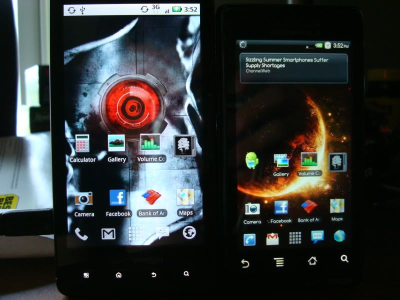
Just stopped in at the verizon store and played with the x to compare to my incredible. Overall, the screen was significantly less vibrant and the phone was too big. The UI was also nowhere near as smooth as sense. Websites also loaded slightly faster on my incredible head to head to head with the verizon tech.

Id tell myself that as well if I had an incredible and didn't want to succumb to purchasing a new device for $600.
 
Here's one from damstr...

DSC00770.jpg
 
I compared it to the incredible. The Inc colors are more vibrant but they're over saturated and inaccurate. Flesh tones seemed too red for example. And I compared a picture with grass that looked much more accurate on the Droid than on the Inc. On the Inc, the grass was way too green to the point it didn't seem like natural grass. It's like turning up the color on a color tv too much. I guess some like that. Not me. Besides pcmag did a scientific, credible screen test and the X had the most accurate color representation out of all the major phones including the iPhone 4.

Also if you're comparing them side by side the brightness must be as close to the same as possible on both phones.
 
A lot of people are going to call the droid x screen washed out. Washed out from what? Reality? no. In fact, every review comparing screen saturation has stated that the droid x has one of the truest displays.

Many phone displays are grossly oversaturated. DInc for example. Original droid is slightly. If you compare to an oversaturated display, yeah it's gonna be washed out :P But it should, unless you like oversaturation. It's like taking a really long exposure shot of a car at noon on a sunny day. It's gonna glow. The blue color of the paint will be so blue that it appears cartoonish.

If you were to take the same photo with an exposure time suited to high lighting, outdoors environment, the car would look duller and the halo would disappear. It would, in fact, take a photo nearly identical to how we see the car. This replication of our senses is what makes photos, and by extension, tv/computer/electronic device displays a heated topic. Some like the extra saturation, some prefer a realistic display.
 
Strange. I tested again today and though the X is not as vibrant, it looks far better than the EVO display and not too distant from the Inc as the EVO was. The Droid looked the same to me as the X, but I was more focused on comparing the Inc.

Also, when surfing web pages and playing vids. I appreciated the extra size far more than the inherent tech issues of lcd verses amoled.

EVO display looks like a cheap display compared to the X. I expected them to look the same.
 
The lower left button on keyboard. The one that has the picture of the gear and" ?123" - is that key blurry for anyone else?
 
No it's not. Mine is great when next to my brother's Droid. You must have a defective one or don't know how to turn up the brightness?
 
Now take the Droid X and the Incredible or Vibrant outside and compare them in the sunlight. ;)
 
I don't know what you are complaining about. I am mesmerized by how beautiful the screen looks on mine. Maybe you got a bad one.
 
The VZW sold me the anti-glare screen protectors (I wasn't paying attention). Even with it on, the screen looks great IMO. I had the INC and it looks great, but is definitely over-saturated. (It's like TVs at the store, they are overcranked to "pop" and grab your eye, but are totally innaccurate color reproduction). Personally, the size trumps the brightness for me. Also, I am sure an app will come along with contrast, tint, brightness adjustments....
 
Just looking at the comparison, there's nothing more 'vibrant' about the original droid. If you want to talk washed out though, compare the facebook and bofa icons. The original droids icons look washed out, imo. YMMV
 
Look at the Volume Control icon and the Maps icon. They are clearly more vibrant on the old Droid than on the Droid X.

I'm guessing here, but maybe thats cus of the background? I notice the icons on the X u mentioned are sitting on white areas of the background.

Change it to something darker on the X and see if u can see a difference. Likewise, change the background on the Droid to something white-ish and see if there's a difference.
 
Look at the Volume Control icon and the Maps icon. They are clearly more vibrant on the old Droid than on the Droid X.

The icons are semi transparent...you've got the X with a lighter background behind the volume icon and a brighter orange behind the icon on the other phone. The bank of america icons look the same, you're over analyzing things.
 
I don't understand what everyone is complaining about. I think the screen looks just fine.
 
Droid X versus Droid. Notice the button background colors. This is default in Android and happens to my app. Now I may have to do an update, which is a pain.
 

Attachments

  • google_droidX.jpg
    google_droidX.jpg
    71.7 KB · Views: 88
  • google_droid.jpg
    google_droid.jpg
    65.4 KB · Views: 90
Id tell myself that as well if I had an incredible and didn't want to succumb to purchasing a new device for $600.

I am within my 30 day trade in period and had the money in hand to switch. I left unimpressed and it is well documented that the phone lags when scrolling between home screens with the stock UI. I didn't say it wasn't a nice phone.
 
I hate the Verizon screen protectors--and although I love the phone, I do like my Inc screen a bit better. Will see with new protectors on.
 
Back
Top Bottom