• After 15+ years, we've made a big change: Android Forums is now Early Bird Club. Learn more here.

Too much monochrome in Lollipop?

It might not be the real notepad with tearing sheets, or the reel to reel podcast player, but it's a start. Google Play Books does have a 3D page turn for those like myself who love skeuomorphism. Lollipop is only the start to something better just wait.

The Oppo stock media player does show a skeuomorph of a cassette with the reels going round, when in landscape mode. However podcasts never came on reel to reel tape media, and the word is a contraction of "iPod" and "broadcast" of course. :)
 
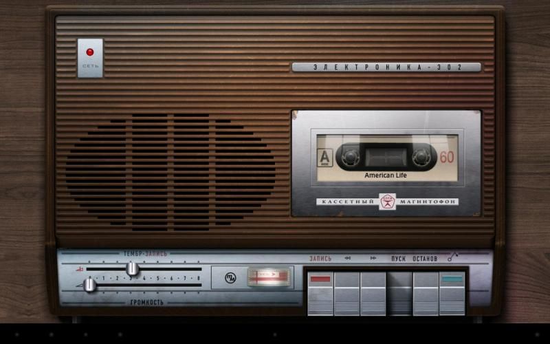
MikeDT, you can also download a load of apps that replicate the Walkman player with cassette tapes. i know i bought 3 awhile back. worked well until they started to crash outright in KK. one of them was called 'Mafon' which replicated a Soviet-era tape recorder. i liked that one and it was a very polished app that i originally used on my iPad 3 (until iOS 7 killed it like KK Android did).


^ Some extension hacks to a podcast filename can make it work in an app like this too.


I await the day when apps that look so detailed can once again grace our high-resolution displays. when an app dev takes the time to incorporate such detail vs. designing in MS Paint, the results speak for themselves.
 
I don't look at the screen too much when I'm playing my sounds. I usually have something else to occupy myself with....and even if I don't, watching animated reels go round does become boring after a while.. :D
uploadfromtaptalk1419139774660.jpg
 
It's a personal view of course, but I find most skeuomorphism pointless, and usually annoying. As an engineer I take the view that form should follow function, and good engineering design is what leads to iconic form. The audio cassette is a perfect example.

If you create a new function, e.g. digital media, then you should apply the best functional design, which will result in a new form. The iPod is a prime example of that.

I much prefer developers to spend their valuable time building the best functionality with zero bugs rather than spend hours creating "cute" UIs and gratuitous animated graphics.

The same consideration also applies to forever having to re-work apps to keep up with Google's latest fashion statements (which is what UI revamps ultimately are). I've dabbled with Android development, but I'm not going to try creating a proper app, largely because I'd be forever chasing my tail re-coding it for every new version of AOS.
 
So would you prefer we still used the Cupcake UI?
Just because Google calls something an improvement doesn't mean that all of us are willing to bow down and praise it, and that if we don't, we're some sort of throwbacks.

Like them or hate them, Sense and TouchWiz have shown consistent, superior app design integration for years.

Would you like me to post the list - again - of the things that Sense had years before Google, but in a fabulous ostrich fashion, have been heralded as improvements invented by Google when finally brought to Android?

It's pretty long.

If you like "Material Design" fine, great.

It might be a revolution at Google and for you - and that's great too.

It's about time they introduced some sort of common design approach because unlike the OEMs they've never had it before.

But if you tell me that this is something of an important first then I'm going to tell you that no matter how cloying, Kool Aide never tastes as good as you think! :D
 
MikeDT, you can also download a load of apps that replicate the Walkman player with cassette tapes. i know i bought 3 awhile back. worked well until they started to crash outright in KK. one of them was called 'Mafon' which replicated a Soviet-era tape recorder. i liked that one and it was a very polished app that i originally used on my iPad 3 (until iOS 7 killed it like KK Android did).


^ Some extension hacks to a podcast filename can make it work in an app like this too.


I await the day when apps that look so detailed can once again grace our high-resolution displays. when an app dev takes the time to incorporate such detail vs. designing in MS Paint, the results speak for themselves.


I just tried Mafon. It looks nice, thing is on a 5.5in phone screen, the controls(cassette piano keys) are rather cramped and fiddly to use, certainly compared to operating a real cassette deck. And obviously it would be worse on smaller screens. To me this is definitely form NOT following function.

The Oppo cassette one, is actually controlled by gestures, swipe or tap, to pause or skip songs, and if you hold the phone in portrait mode(vertically), it changes to a much more conventional media player design, with large finger friendly controls.

IMO Apple GarageBand is a good example of skeuomorphism done right. Function is the most important, but at the same time it's still visually appealing, and looks like it might be a piece of studio equipment, with wooden bezels, 3D looking knobs, sliders and meters.
 
Just because Google calls something an improvement doesn't mean that all of us are willing to bow down and praise it, and that if we don't, we're some sort of throwbacks.
...
It's about time they introduced some sort of common design approach because unlike the OEMs they've never had it before.

Absolutely - it's the difference between continuous improvement and repeated radical changes.

With the former, each change is incremental and builds on what's gone before. An app that doesn't incorporate the latest update isn't immediately obsoleted.

Radical changes are the way the fashion industry works, the whole point is to make you buy a new wardrobe even when there's nothing wrong with the clothes you've got.

To illustrate, before JB the default display style was dark on light. JB introduced Holo, and the "great new thing" was light on dark - supposedly "better". But now it seems we've gone back to dark on light, which is again "better". They can't both be right - that's not improvement, it's fashion.
 
Holo came out with Honeycomb and grew to include light and dark themes.

http://pocketnow.com/2014/05/01/android-holo-theme-dead

Nonetheless, I agree with you about the whole fashion comparison.

HTC used to have a fluid recent apps animation.

Omgz pwnies! It's so bloated! It's eye candy!

So they flattened it.

Omgz pwnies! They're finally getting it right!

Lollipop introduces the rolodex style recent apps.

Is it eye candy? Is it bloated?

Gosh no, not when Google says it's ok.

But wait for it -

http://phandroid.com/2014/12/22/one-m8-lollipop-update-leaked/

I can't wait to get features that I had in 2011 - like the light on dark quick settings (yeah - they were light on dark in 2011 on Sense before Google even started).

Lapels out, lapels in.
 
I just tried Mafon. It looks nice, thing is on a 5.5in phone screen, the controls(cassette piano keys) are rather cramped and fiddly to use, certainly compared to operating a real cassette deck. And obviously it would be worse on smaller screens. To me this is definitely form NOT following function.

The Oppo cassette one, is actually controlled by gestures, swipe or tap, to pause or skip songs, and if you hold the phone in portrait mode(vertically), it changes to a much more conventional media player design, with large finger friendly controls.

IMO Apple GarageBand is a good example of skeuomorphism done right. Function is the most important, but at the same time it's still visually appealing, and looks like it might be a piece of studio equipment, with wooden bezels, 3D looking knobs, sliders and meters.
Mafon was intended mainly for tablets with 10.1" screens. There are others that are made for phones (one is simply called 'tape')
I think it adds a level of familiarity and comfort to replicate some real world objects still. Otherwise the interface feels sterile, boring and cold. And, again, wasn't flat design done before? Would you rather use Mac System 6 again? Or Windows 1.x? I don't. What good are the specs of our devices if we throwback to the old days? Heck, put iOS 7 next to iOS 6, and 7 looks like the older version! Much like how Windows 95 looks old compared to Windows 98SE. Only irony is that iOS 7 is newer but looks as if it got inspiration from the early 1990s

FYI Jonathan Ive also killed Garage Band.

I want Holo to die. Bright electric blues on dark and very creepy and cold looking UI elements. Doesn't provide the attraction in my view. No wonder I preferred Apple back then. As far as I see it, I'd rather see Material work. Its either that, or relive the bad days of MS-DOS shell again. This is 2014, not 1994
 
Last edited:
Mafon was intended mainly for tablets with 10.1" screens. There are others that are made for phones (one is simply called 'tape')
I think it adds a level of familiarity and comfort to replicate some real world objects still. Otherwise the interface feels sterile, boring and cold. And, again, wasn't flat design done before? Would you rather use Mac System 6 again? Or Windows 1.x? I don't. What good are the specs of our devices if we throwback to the old days? Heck, put iOS 7 next to iOS 6, and 7 looks like the older version! Much like how Windows 95 looks old compared to Windows 98SE. Only irony is that iOS 7 is newer but looks as if it got inspiration from the early 1990s

Now are we talking about real world objects of today or are we getting into (hipster) nostalgia? Personally I don't wish to be reminded of Soviet made cassette decks....LOL I had one in the 1980s, a Rapri, the thing just didn't work properly, and it could never have worked properly when it left the factory, the circuit design was botched. In fact our family had a lot of experience of Soviet and Eastern Bloc made products, cars, cameras, TVs, radios, they were cheap, but many of them were crap though, especially Skoda and Yugo cars. Lomography anyone?

When I used to use Windows, I've always used it in Basic made, which is completely flat, 2D and grey. I didn't really care much for Aero Glass in Vista and 7, which was a power guzzler. One of the power saving features of Vista and 7 is to turn off the 3D, transparency and blurring of Aero Glass and switch to Basic, automatically when running on batteries.

FYI Jonathan Ive also killed Garage Band.

I thought GarageBand is still very much a current product. It's showing as available for OS X and iOS.
http://www.apple.com/mac/garageband/

It's been updated to have iCloud integration, but it still looks very much the same, wooden bezels, 3D looking knobs and buttons, etc. And they still do Logic Pro as well, which is based on the same skeuomorphic UI.
 
Last edited:
When I said Ive killed GB I meant he put his crap flat design feel to it.

I'd rather have truly future looking interface than a throwback to the 1990s. Should we go back to 640x480 16-color VGA? Most flat designs have tons of wasted space (seems to be a feature) for anything higher. This is why lollipop is important to me. The first time since flat design took over I see the return to 3D. At least to an extent. A more future looking spin on skeuomorphism. The 3D looks nice and adds function and feedback of what's happening. I would like the glossy UI back and apps that at least resemble the device they're using the function of (a notepad that at least looks like a notepad not black text on blinding white). But of course I think sadly those days are done unless I bought an iPhone 3GS on eBay
 
Last edited:
When I said Ive killed GB I meant he put his crap flat design feel to it.

I'd like to know how you came to that conclusion.

That's GB 08 as running on my Macbook here.
garageband08.jpg


That's GB from Apple's website today.
garagebandtoday.jpg

That guitar amp control looks highly realistic to me, definitely a skeuomoph...LOL And there's plenty of gradiants, 3D looking controls, detailed realistic instrument icons, the wooden bezels are still there.

I'd rather have truly future looking interface than a throwback to the 1990s. Should we go back to 640x480 16-color VGA? Most flat designs have tons of wasted space (seems to be a feature) for anything higher. This is why lollipop is important to me. The first time since flat design took over I see the return to 3D. At least to an extent. A more future looking spin on skeuomorphism. The 3D looks nice and adds function and feedback of what's happening. I would like the glossy UI back and apps that at least resemble the device they're using the function of (a notepad that at least looks like a notepad not black text on blinding white). But of course I think sadly those days are done unless I bought an iPhone 3GS on eBay

We have powerful GPUs and CPUs, which can do all this beautiful 3D and shine and other eye candy, however phones and tablets primarily run on batteries, and don't have the asinine need for mains power outlets. Which was a main reason why Win 8 went to a rather plain flat UI, and no more Aero Glass.

We can have all the 3D, realism, gloss, shine and transparency with like, but as long as we're happy with the shorter battery life, and having to charge our mobile devices more frequently....that's it. No problem on a desktop system, or a laptop that's plugged in to a power outlet of course.
 
Last edited:
Doesn't your MacBook run older OS X? Mine runs Yosemite. Garage band on it not only has a cheap icon but also has Ive redesign like ios 7. GarageBand is also currently at version 10

You left out the fact that Windows 8's flat UI is completely optional. There's a desktop mode that brings back the Polish of Windows 7. See, even Microsoft understands the value of giving users choices.

I also don't recall iphones having issues with battery life in ios 6. There were tons of complaints about it as of iOS 7 however. The iPhone used to get much better battery life than Android which only recently got their devices to get at least a day or two
 
Last edited:
I was getting 8 hours of screen on time on my Evo 4G LTE, stock, over the course of a lot more hours than that back in 2012 - longer battery performance has been enjoyed by a number of us for quite some time.

Like Garage Band, that has nothing to do with the subject though. :D ;)
 
Seriously? No one heard my complaints about flat design all the years I've been here?

Material Design isn't flat! I've said it many times on G+ and will say it here. Android 5.0 despite the cheesy name is not flat. It has a 3D task switcher. Layered 3D quick settings. Floating textured buttons. It is the first step in a hopeful revival of skeumorphism and progress towards true 3D holographic Interfaces. I may be old, and perhaps flat design is only future looking for the younger set. But I have lived through Flat design during these eras:

Amiga Workbench 1.3
1a0ca13067a47325cb3220cbdf420635.jpg


Windows 1.x
7db1af01cc809b82a2fe488e5918e646.jpg


And, Mac OS System 6
c370222fb93907fb90ec399139ec9d69.jpg


Is it really so hard to believe a throwback to interfaces 20 years out of date is anything but backwards evolution? Our phones and devices have much higher resolution displays and hardware to pull off impressive UI and do tons. Yet we relive the harsh early days of the Commodore Amiga and Macintosh SE/30.

I don't know about you guys/gals, but I'm not that nostalgic. The 1980s were a dark era of computing I'd rather forget. Days when 4 - color CGA, text adventure RPGs, and resistive touchscreen Apple products were the norm. In 2009, resistive touchscreens and finicky versions of Android are also eras I've moved beyond.
 
Last edited:
I thought one premise of Material Design is to show you cutesy cartoon graphics, instead of useful information.

Don't particularly care much for the new Google calendar UI. And if we're going to be seeing more of this stuff, not really interested.
uploadfromtaptalk1419633524579.jpg
 
Back
Top Bottom