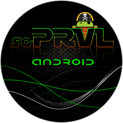
This is my sketched out logo.
Rough draft so to say.
I'm thinking like one of you guys said.
To put the pirate android in there.
If we made the PRVL a little thicker then we could defenetly peek him in.
A little closer to what you had in mind?
I like the top half of the image, the rest ('android' down), though it looks nice, seems like fluff. Very nice image though, I'd paste it on my car, or my helmet.
Has anyone thought of putting the android head as the top of the "P" or "R" ? I think in the r would balance more nicely, but I'm not great at throwing something like that together. (and that way maybe the cossbones could be part of the lettering as well- maybe like a ghost or shadow image inside of it- but that could also end up looking overdone... would have to actually see it.)
")
 Starting off with a boot animation is good too


 I think that my health has finally gotten to the point where I can do it. Now I just need to make up my mind whether I want to do it or buy a new Kia Soul. The wife has been wanting one since they came out. Those little suckers have all kinds of room inside too. If I wasn't married I wouldn't even need to think twice about it. Oh how things change once you put that ring on your finger.
 ")