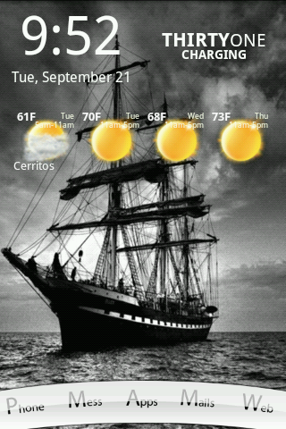
Thanks! Once I found the right pictures, the Photoshop work and setup took about an hour or two (I'm slow and easily distracted, so YMMV). I used the template from the tutorial, and it made it pretty easy. It helps to have at least limited Photoshop skills (knowledge of layers at a minimum), but honestly the most complicated thing was the clipping mask on the 3x1 icons. I sketched out the layout on a pad of paper before I started, so I knew what side I wanted the labels on; then I made all the 1x2 icons, then all the 3x1 icons.
Making the icons was the hardest part, laying them out on the screen was easy, just time consuming. I'm really happy with the way it came out.
")


")