Agreed, the whites in the SGS2 pic above look awful. I don't remember noticing poor whites on the Droid Charge (w/same screen) I had for a few weeks. I don't know what to think, but I sure hope Nexus is bright w/better color fidelity.
I've compared my DX2 side by side to several charge's (yes same screen brightness set to highest) and it is literally night and day brightness levels. i honestly prefer my DX2 diplay by far for this reason.
I like IPS. The Asus transformer I am typing on has an IPS. IPS has light bleed issues as it's worst problem IMHO, but honestly it's something that you have to look for in a very dark room. It's not noticeable otherwise. I believe iphones use IPS but I heard they are going away from it in the future. All displays have some inherent positives an negatives unfortunately. Personally I like deep colors WITh true bright whites - something we don't see in the same display often enough.
For whatever little you can gather from the videos, seems texts are a bit clearer and colors more accurate with LG display. Movies and pictures probably going to be the strength for SAMOLED HD.
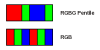
Those calculations may apply for RGBW (I haven't had a chance to think about it), but they definitely don't for RGBG. The surface area of RGBG will be exactly the same as for plain RGB for any color background (ignoring black voids between subpixels, which is beyond me), so one can guess the brightness and power draw will also be about the same.
See the .png I made for this -- different numbers of subpixels, but the same cumulative areas for each of R/G/B across pairs of pixels.
Occurs to me that there's a decent overlap between the benefits of using CMYK printing and those claimed for the PenTile RGBW variant: purity of the black/white color and the efficiency of producing it. Thoughts?
i really dont feel like reading through the forums to find the answer, so the prime wont have super amoled hd and istead a pentil!??!?!?!?!! first no exenos, now this!?!??!! ugh
Those calculations may apply for RGBW (I haven't had a chance to think about it), but they definitely don't for RGBG. The surface area of RGBG will be exactly the same as for plain RGB for any color background (ignoring black voids between subpixels, which is beyond me), so one can guess the brightness and power draw will also be about the same.
See the .png I made for this -- different numbers of subpixels, but the same cumulative areas for each of R/G/B across pairs of pixels.
Not sure if this has already been covered in the discussion already, just skimmed through it, but the whole discussion of pentile seems a little bit of an abstraction? I mean at that DPI the human eye can't even discern pixels, much less subpixels. Can anyone explain how the subpixel arrangement is going to have an effect on the sharpness of text at these DPIs? I see lots of pictures here of the Note, whose DPI is ~285 and doesn't cross that magical threshold where pixels become invisible (it must be magical right, because Apple said so?), so it doesn't seem particularly applicable to the Prime.
There are two things to consider here. You create colors on a display like this by turn off/down certain sub-pixels. To create a solid black line, you turn off all the sub-pixels in an RGB stripe. In a PenTile display, however, you don't turn whole pixels off because the pixels don't have real physical coordinates.
Combined with the fact that, say, next to each other RGBG pixels still appear white (and not some super green white,) there will be instances where you end up making a black line by turning individual sub-pixels off. Where a hi-red, hi-green, low-blue color meets black, you will end up with something like (X means off/black) this: XGRX RGXX XGRX RGXX
Which results in a fuzzy edge.
If you then take a 2:1 ratio, it would look something like this: XXGRRX RRGXXX XXGRRX RRGXXX
Which makes the edge look even worse.
Of course there's a lot of 'magic' that goes into blending pixels together, but you get the basic idea.
This is not how it works. The subpixel rendering includes sharpening technology.
Full Disclosure, I am the CEO of Nouvoyance, the company that developed PenTile Technology in partnership with Samsung.
This is how it would look for a yellow vertical line:
XXXGXX XXRGXX XXXGXX XXRGXX
A vertical white line on black looks like this:
XXBGXX XXRGXX XXBGXX XXRGXX
So the verticals remain sharp. The horizontals look like this
XXXXXXXXXXXX BGRGBGRGBGRG XXXXXXXXXXXX
So they are also sharp.
RGBW actually gives the power savings. Because the white pixel doesn't affect colors, it effectively increases your brightness by 25% at the same backlight power. Unfortunately it also increases the distance between colored sub-pixels, making blending less effective, and thus harming color reproduction.
The author is again wrong. The transmittance increase from the addition of the white subpixel is 50% more, not 25%. Further, the increase in aperture ratio from reducing the number of subpixels adds another 50%, for a total increase in transmittance of 100%, or twice as efficient.
The white subpixel serves as a color primary, just the same as the red, green, and blue... so they also participate in the blended color. The PenTile RGBW algorithm accounts for this effect. Also, the saturated color primaries are NOT too far away to blend together. They blend just fine, as a white background proves, else they would look like separate color dots, not white.
Hey - it's Saturday. Figuring out what to move and what not to move wasn't easy.
Now that we have our own thread, I can happily square that point away.
Instead of small vs. big, the math is simple - PenTile subpixels are 50% larger than rbg subpixels.
1 pixel = 3rgb = 2 pentile, so pentile = 1.5 rgb - all other math flows from there, but there's the degenerate case to clarify:
On a hypothetical 3"x4" screen, using the same chemical formulations for SAMOLED/+ pixels, displaying an all-red field, the rgb screen will light up:
1/3 x 3 x 4 = 4 square inches of the screen
Whereas the Pentile will light up:
1/4 x 3 x 4 = 3 square inches of the screen
To produce the same effect, the PenTile will have dynamically increase brightness (and consume more power) - and by design, it does.
Assume that an rgb subpixel represents a unit area.
Red would be produced by 921600 unit areas for rbg.
Red would be produced by 460800 x 1.5 = 691200 unit areas for pentile.
691200/921600 = 3/4, same ratio for the shortcut math I started with, comparing ratios of 1/3 and 1/4.
There is an error term due to mask width, but it's minor.
And if you look at fields of color and work down, you'll find it always comes out this way, regardless of pixel sizes.
If my hypothetical 3x4 pentile screen had only two rgbw pixels, a full field display of red would still be 3 square inches.
Hope that clarifies why PenTile needs that processing, has that processing, and while honestly claiming many benefits - does not save power or use more, integrating over a full range of use cases.
No... this math is not right... PenTile allows MORE of the surface area of the screen to be illuminated, not less. This is because less area is wasted in the black gaps between subpixels. Each subpixel must be separated from its neighbors by a fixed width black gap. Fewer subpixels, fewer black gaps. This in turn allows us to turn down the brightness of each subpixel, keeping the power the same, but the current density is lower, increasing the lifetime of the emitter material.
In regards to this device, which is the only thing most of us care about, from the early hands on previews I haven't seen one negative thing said about the screen. In google presentation they kept emphasizing clear text.
Has anyone read any negative about the screen or even comments about it being PenTile?
The author is again wrong. The transmittance increase from the addition of the white subpixel is 50% more, not 25%. Further, the increase in aperture ratio from reducing the number of subpixels adds another 50%, for a total increase in transmittance of 100%, or twice as efficient.
Also, the saturated color primaries are NOT too far away to blend together. They blend just fine, as a white background proves, else they would look like separate color dots, not white.
That sounds counter to what you wrote elsewhere in these forums:
"the distance between the same color subpixel is increased, compared to an RGB Stripe panel, and "pattern visibility", called the "screen-door" effect here, may occur for solid colors. This is one reason why PenTile technology is only recommended for higher resolutions. As displays continue to be spec'ed at yet higher resolutions, this effect will become less of an issue."
but I'm reasonably sure you're right that higher resolutions render the issue moot.
So many good posts in this thread, thanks to everyone for taking the time to share your knowledge.
My only complaint is all you damn big screen phone junkies that caused Samsung to deliver this phone with a 4.65 display. Imagine how beautiful Super Amoled Plus with a higher resolution than 800x480 would look on a 4" screen (the absolute perfect size IMO). And then put that screen on a beautiful chassis like Samsung built for the Nexus, my mouth is watering just thinking about it. I sincerely hope the large screen fad dies out eventually because otherwise packing all these amazing specs into a 4" screen phone is never going to happen.
Me too, but I don't love big phones. However, big is a relative term and it could be that I have small hands or something. But, I also prefer a phone not too be bulky in my pants pockets. I just think the perfect size screen for a phone is 4" and the perfect design is slim and light similar to the Galaxy S2.
I just wanted to chime in with my opinions on PenTile displays. But first, my "qualifications."
-In the past year I had iLASIK surgery and now have 20/12 vision.
-I'm a videophile. If you turn down the AA or AF by one notch on my PC games, I'll whine like a bitch (no really, my wife has to smack me for it)
-I can see a visible difference between 1080p and 720p on my 46" LCD from 8 feet away. It annoys me.
With that said, I don't have a problem with PenTile displays, per se. They're not all bad. All three Nexus phones have used them (Yup, the N1 and NS used them). The Galaxy S first-run used them, yet they were lauded for their display tech. In fact, this same exact display (@720p) is being used in the Galaxy Nexus! My OG Incredible AMOLED version uses PenTile. It's never once bothered me, and that's saying something.
However, on the bad side, three friends of mine have the Droid X2, Atrix, and Bionic. They all use the same qHD PenTile LCD, and they look like thrice baked ass, especially when looking at photos. I don't know if it's the Pentile arrangement, or something else Moto did when going cheap on these displays. All I know is that I could never own one of these phones. The RAZR looks to be what the Bionic SHOULD have been.
With that said, if you've ever used an N1, NS, GS1, Incredible, etc., and didn't have issues with the screen, you'll absolutely love the screen on the Galaxy Nexus. PenTile has become a bad word, and to be honest, I'd rather not have it. However, the PPI of the GN is superior to my Incredible, and the GS1's display was always superior to mine, so I'll take it. I'll even take the RAZR's screen.
NOTE: The only thing that pissed me off about the Incredible's display was that it wasn't a true 24-bit panel and only did 16-bit color. The SLCD would take a 24/32-bit input and dither it down to 18-bit, which was a little better. Super AMOLED is a 32-bit panel. For those coming from either version of the Incredible, you'll be pleased with the Galaxy Nexus' display.
However, on the bad side, three friends of mine have the Droid X2, Atrix, and Bionic. They all use the same qHD PenTile LCD, and they look like thrice baked ass, especially when looking at photos. I don't know if it's the Pentile arrangement, or something else Moto did when going cheap on these displays. All I know is that I could never own one of these phones. The RAZR looks to be what the Bionic SHOULD have been.
I agree that Motorola's RGBW screens don't look that great at their large sizes and comparitively low resolutions. A lot of people notice this too, and it's really given a bad name to all PenTile arrangements recently. :/
I believe I agreed (or I at least intended to but forgot ) that horizontals are great.
Also, I wasn't stating that was what a yellow line would look like - I simply gave my own theory as to why high-contrast vertical edges do often get fuzzy/blurry on a PenTile screen, giving a red/black edge as an example. I stated a number of times that it was all conjecture on my part.
The author is again wrong. The transmittance increase from the addition of the white subpixel is 50% more, not 25%. Further, the increase in aperture ratio from reducing the number of subpixels adds another 50%, for a total increase in transmittance of 100%, or twice as efficient.
The white subpixel serves as a color primary, just the same as the red, green, and blue... so they also participate in the blended color. The PenTile RGBW algorithm accounts for this effect. Also, the saturated color primaries are NOT too far away to blend together. They blend just fine, as a white background proves, else they would look like separate color dots, not white.
Good to know about the actual numbers on that white sub-pixel.
And I never said that the white pixel stopped blending. However, I have observed the greenish yellows and sometimes even 'flyscreening' on the Motorola Atrix. Either that's an inherent problem in RGBW PenTile, or Motorola broke it somehow putting it into their phones.
Since your post came across as somewhat hostile, I'll point out that I'm not some kind of anti-PenTile crusader; I came into this thread defending PenTile.
I thought the screen (SAMOLED+) on my SGS2 was fantastic, so if the SGN has even better density in spite of the PenTile arrangement, it may not be so hard on the eyes after all.
Since your post came across as somewhat hostile, I'll point out that I'm not some kind of anti-PenTile crusader; I came into this thread defending PenTile.
Heh, you beat me to posting that. Thing is, I still think the author's calculation of subpixel density is wrong, even though he went back and forth with a couple of posters there.
Seems to me average subpixel density accounting for both horizontal and vertical is:
sqrt(total subpixels / total square inches of display)
This site uses cookies to help personalise content, tailor your experience and to keep you logged in if you register.
By continuing to use this site, you are consenting to our use of cookies.
")
")

 ) that horizontals are great.

