Granite1
Zercron Encrusted Tweezer
Plus, I'm with you, there's no substitute for just RTFM!
:rofl:
Follow along with the video below to see how to install our site as a web app on your home screen.
Note: This feature may not be available in some browsers.
Plus, I'm with you, there's no substitute for just RTFM!


")

I think there's an option in Gimp to do this. Must test!!
I took a few more Raw photos this weekend, I'll test a new photo.
EDIT:
I can't seem to get what he's trying to tell me to do here. I'm obviously holding it wrong.
Have you had any success with this EM?
I had some success with other, then got pulled away.
Btw - I was too on Gimp 2.8.10. Turns out yours is cutting those back to 8 bit layers too. 16 bit support is coming in Gimp 3. I started to look at the alternatives they suggested - see first note - called away.
When I get back to my desk I'll post up the command line I saved.


Excellent!!
Ok, whats different from a .tiff / .ppm?
Must research......
EDIT:
.ppm's aren't compressed!
At least thats what I read. Assumed this is the advantage EM?
So, I've been reading quite a bit.
Want to see something interesting from dcraw?
Drop the -T go to -q 3 -m 40 -a
You'll get a ppm file.
dcraw -v -4 -q 3 -m 40 -a IMAG0003.drawdcraw -v -4 -q 3 -m 40 -a -r 2.132583 1 1.480864 1 IMAG0003.drawPure Dcraw output, if you want to take a look EM:
https://drive.google.com/file/d/0B1xiIlbIPKFDcTlUTE95SF9CVlE/edit?usp=sharing


")

Thanks - I think I'm going to try working on getting the reference values next.
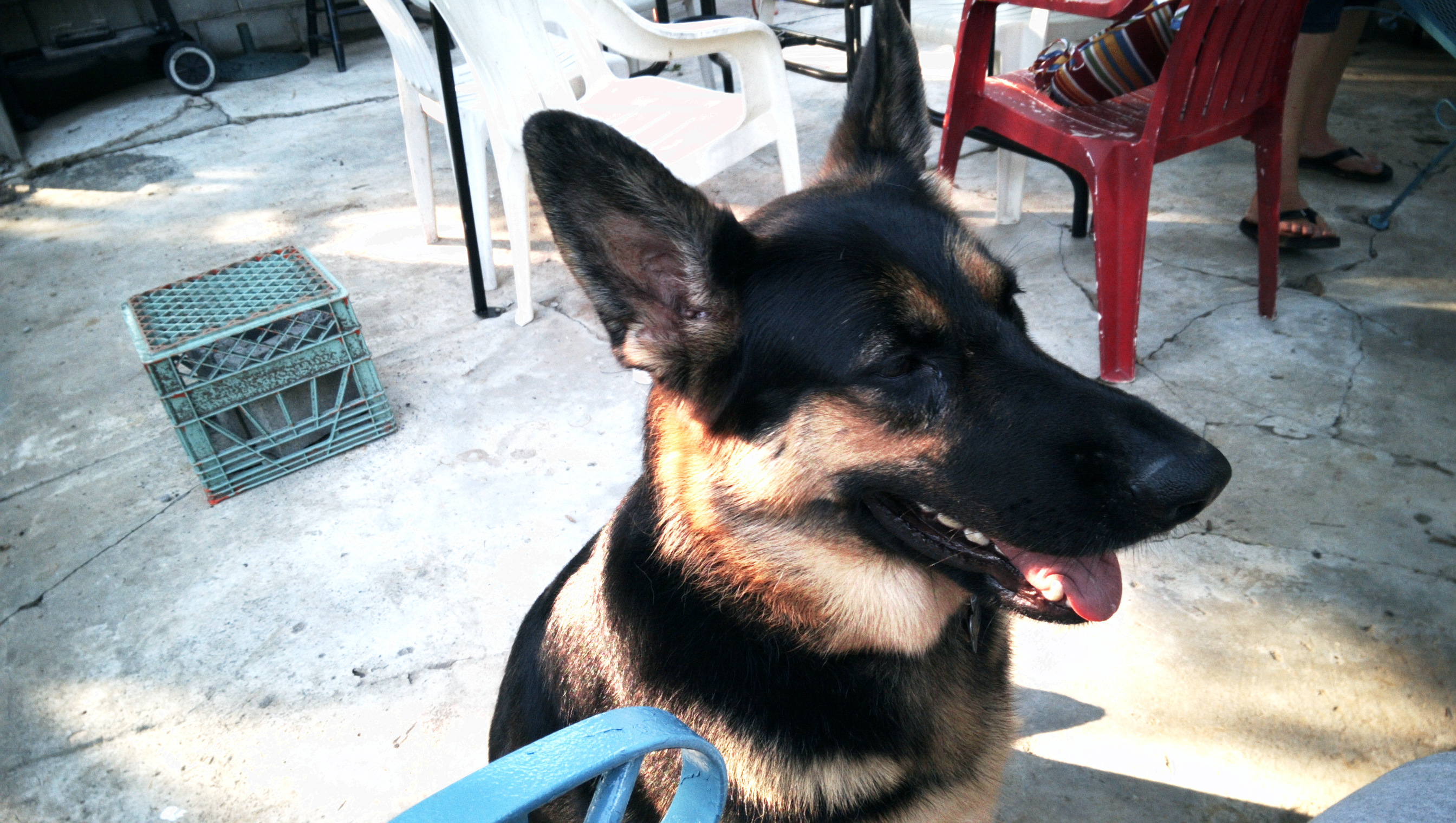
Btw - not sure which is closer to reality but the red chair suggests that I'm still just a bit off. Yes?

Can you put up the IMAG0003.draw file for me?
We have some help in the background requesting access to test some things.
Absolutely: https://drive.google.com/file/d/0B1xiIlbIPKFDYkVNYkRJN2w0U2s/edit?usp=sharing
It's uploading as I type, so it may take a hot minute for it to show up.
EDIT: wrong one EM, fixed link to .draw instead of .ppm
Can haz public access?

