• After 15+ years, we've made a big change: Android Forums is now Early Bird Club. Learn more here.

Post your Homescreens

Hi Bass,

Cool wallpaper, could you post please?

Thanks!

Here ya go:

Android%20Wallpaper%20By%20Liamw.jpg
 
Tremendous thread, I have read all of the posts and was inspired to do some skinning of my own. I was excited to see how I could pretty much re-skin the entire UI with an un-rooted Gnex.

Details:

Nova Launcher Prime
BobclockD3
Circle Battery
Simple Text Widget
Simple Text Icons
Simple Calendar
MetroStation Icons

62f59160-5f49-befa.jpg


62f59160-6152-a2ad.jpg
 
Nothing special. From pics w/ 4 invisible app icons

451dce9b-76c0-e4ca.jpg

Can anybody tell me what the Android Forum little box on my home screen here is?
I got my new phone and lost it (and Tapatalk app) switching everything over.
I can't find tapatalk for free anywhere anymore, so I guess I will buy it when I get paid again.
But I don't know if that's a widget or a bookmark or a shortcut...
I can't remember for the life of me.
Thank-you.

Is it not Phandroid?
 
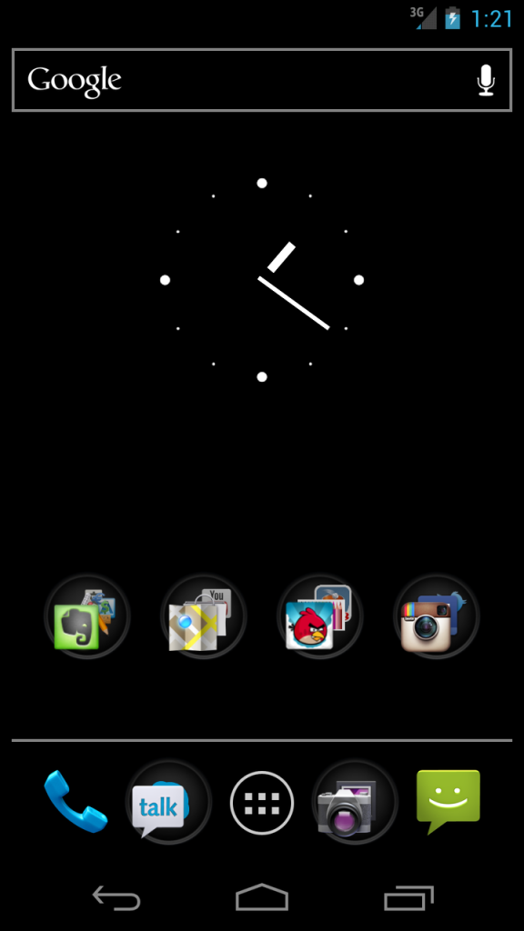
Here's my latest...

0kj37l.png


Black wallpaper
Bobclock D3 - hours gray to match soft keys, minutes ICS blue
Beautiful Weather 1x1 - Crystalx weather skin
Circle Battery (1x1) - color matched to ICS blue / gray
Custom Folder shortcut to most used apps (star from Metro Station icons)
Smooth Calendar widget - text color matched to ICS blue (today) / gray (future events)
Drawer icons - Metro Station Icons - color matched to ICS gray
Nova Launcher
 
I have been following this thread for a while and updated my homescreens lately so thought I'd post them here too!


Lock Screen: 1. Lock Screen.png

Home Screen: 2. Home Screen.png

Left 1: 3. Left 1.png

Left 2: 4. Left 2.png

Right 1: 5. Right 1.png

Right 2: 6. Right 2.png

- Unrooted and not using Nova
- Minimalistic Text for time & date (ICS Blue)
- Circle Battery Widget (ICS Blue)
- Widgetsoid for power controls on 1L
- Beautiful Widgets for weather on 1R
- Wallpaper from Zedge
 
I have been following this thread for a while and updated my homescreens lately so thought I'd post them here too!

There is just something special about blues and papers with blue in them on the GN screen. Also in combo with the stock icons, they just shine. That AMOLED shows it off so brilliantly. Looks good MyGalaxyNexus!
 
I've gotten so many more ideas from this thread my homescreen keeps evolving. I like my original design for it's hyper clean style, but I keep looking for ways to provide more information while keeping a clean interface.

Main change is from Beautiful Widgets and Simple Calendar. Plus some text Icons and an invisible icon for a handy folder.

62f59160-8166-c03e.jpg

I'm no designer. I have little to no artistic ability. I just wanted to share my thoughts since I went through many renditions that were very similar to yours....

Not sure if simple calendar will let you exclude the date from the display at the bottom, but I went with smooth calendar widget because it allowed me to disable the date.... for some reason it bugged me having the date in my clock widget and my calendar widget. It still kinda bugs me that I have the clock on the main screen and in the notification bar. Is that weird???

Also, I tried about 40 million weather skins including the one you have. After a little while I felt the graphics on a lot of them were too cartoony for the clean simple look I was going for. I wish I was artsy enough to make my own.

I considered the text buttons for the dock but never got around to it. Do you find yourself taking an extra second to choose which word to click on or have you gotten used to the location so that you know which app is where without even looking?
 
Back
Top Bottom